Horizon
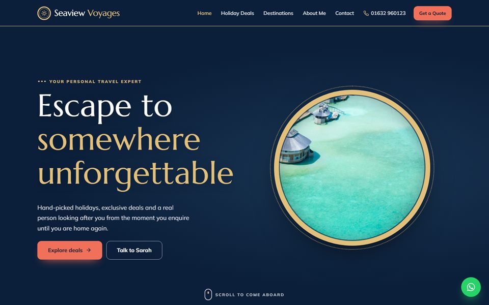
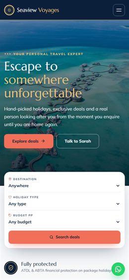
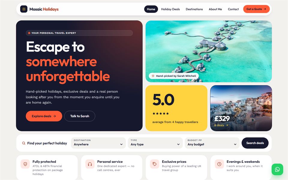
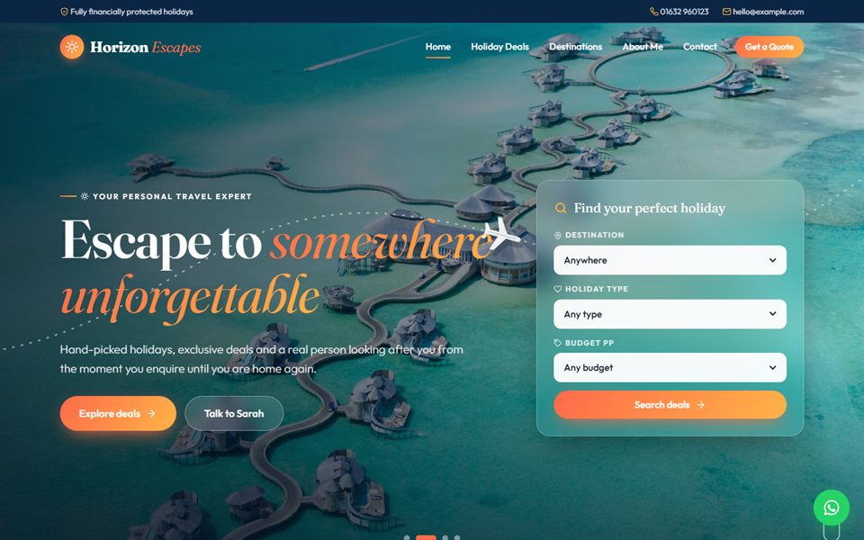
Travel agentsDark, glamorous full-screen photo slideshow with gradient highlights.
The collection
Click View live demo to explore any design as a real website, including its admin panel (log in with demo / demo).
100 designs
Want a design all to yourself? Any design can be bought exclusively for £750 — it’s then taken off sale, so no other business can have it.
Ask about exclusive
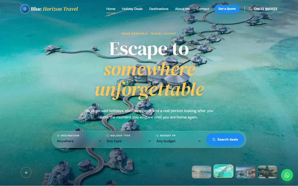
Dark, glamorous full-screen photo slideshow with gradient highlights.
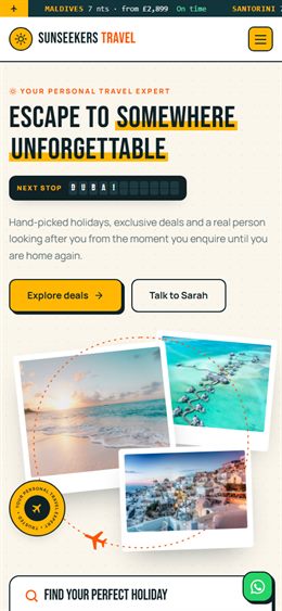
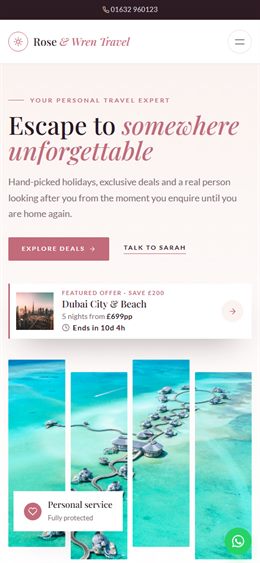
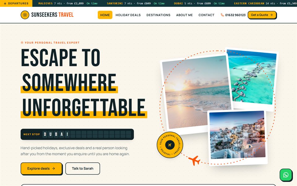
Light and sunny, with boarding-pass deal cards, a departures board and photo collage.
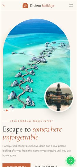
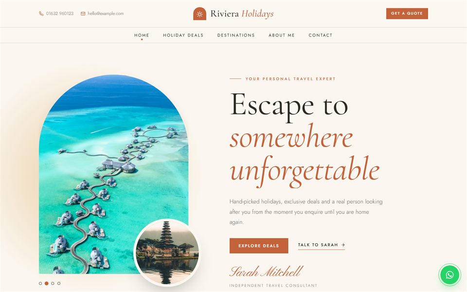
Calm Mediterranean luxury — arch-shaped photos, elegant italics and a rising sun.
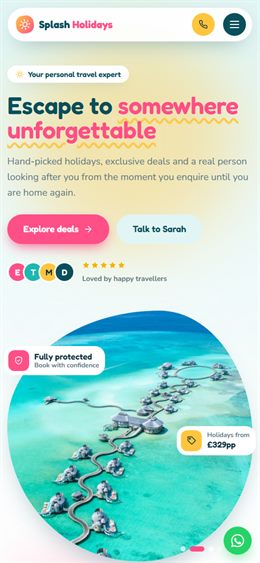
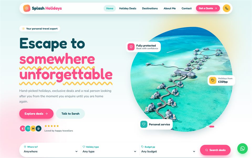
Bright, playful and family-friendly — wavy shapes, floating badges, tilting cards and chat-bubble reviews.
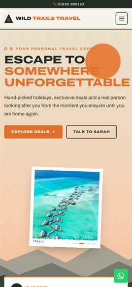
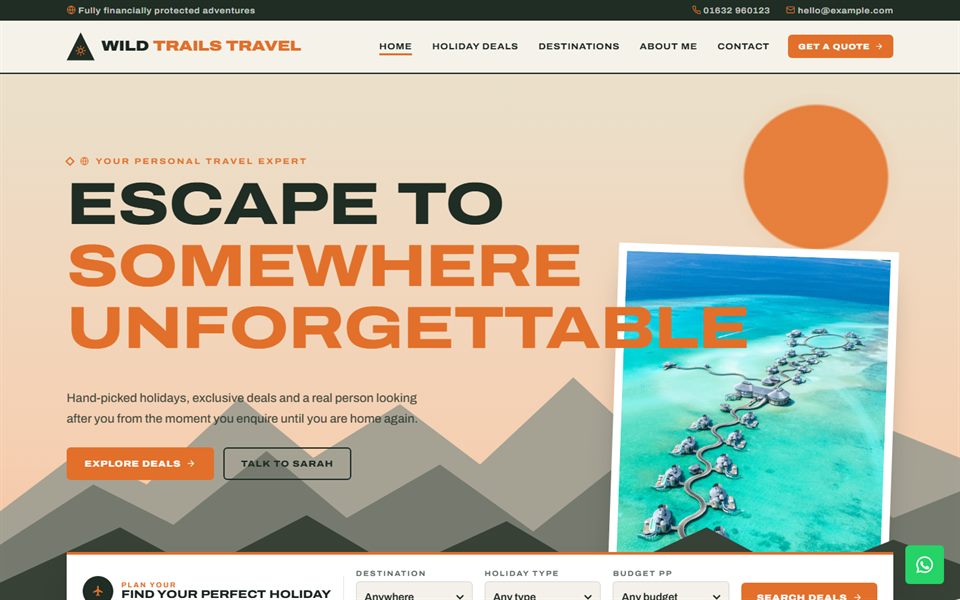
Outdoorsy adventure — layered parallax mountains, contour-map textures, trail-style deal cards and a route map.
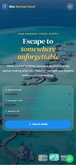
Bright, polished and photo-led — full-screen photo hero with thumbnails, a 3D deals carousel and frosted-glass panels.
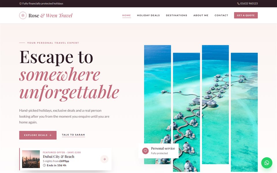
Elegant boutique for honeymoons & luxury — venetian-blind photo hero, editorial deal cards and a destination spotlight.
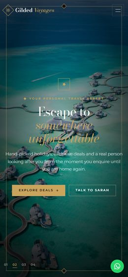
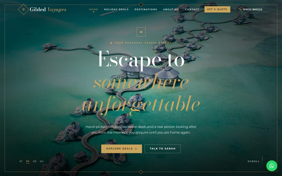
Black & gold luxury — gold-framed photo hero, deals that stack as you scroll, and a dimming destination gallery.
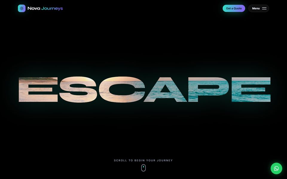
Cinematic & bold — fly through a giant photo-filled word, deals that scroll sideways, a 3D spinning destination ring and aurora glows.
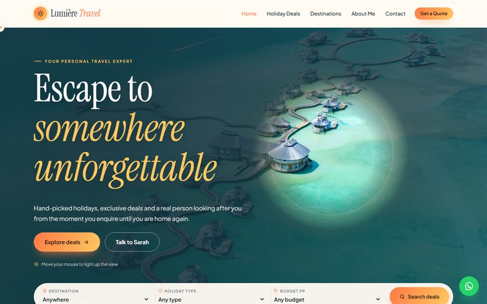
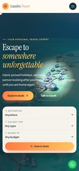
Luminous & interactive — a spotlight hero that follows the mouse, flip-over postcard deals, a scroll-progress plane and a swipeable review deck.
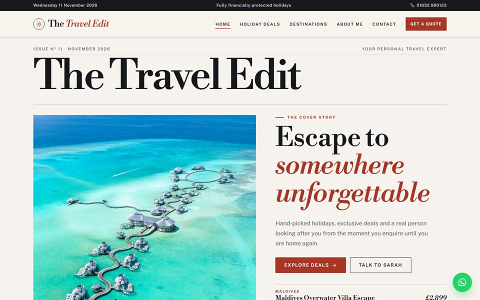
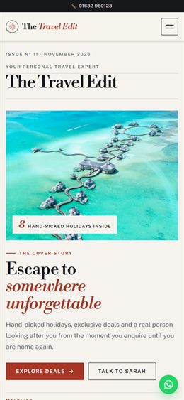
Travel-magazine editorial: a cover-style hero, numbered feature stories, photos that wipe into view and a sticky contents rail.
Cruise & coastal luxury: a porthole hero that opens to full screen as you scroll, a voyage route that draws itself and gently moving waves.
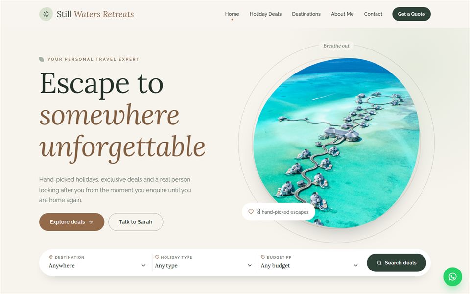
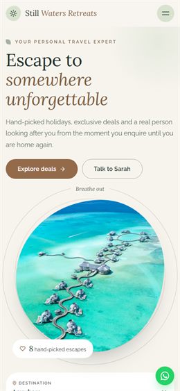
Calm wellness & retreats: soft sage tones, photos in slowly morphing organic shapes, a breathing circle and gentle fades.
Modern bento grid: a tiled hero with rotating photos, tiles that glow where your cursor is and a bold, app-like feel.
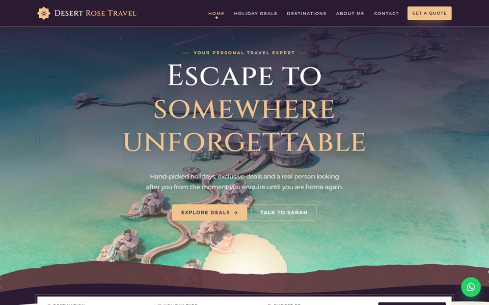
Desert-dusk luxury: a sunset sky over layered dunes, a shimmering heat-haze reflection and gold Moorish star details.
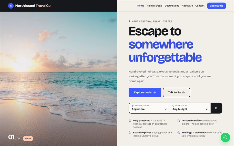
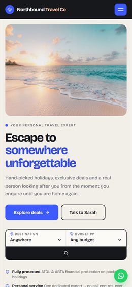
Split screen: one half is a pinned photo that changes as you read, the other scrolls; deals shown as a clean list and a bold modern grotesque type.
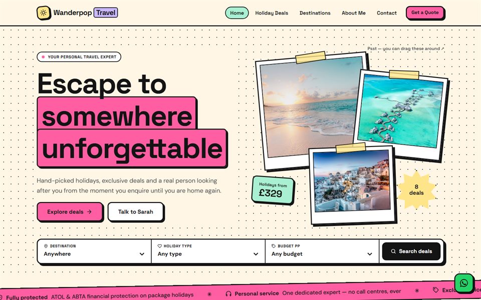
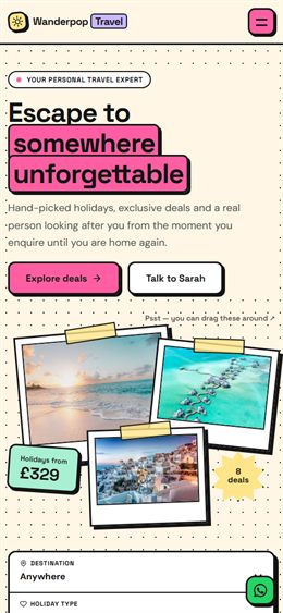
Neubrutalist and fun: thick outlines, hard shadows, pastel colour blocks, sticker-style deals, a scrolling ticker and photos you can drag around.
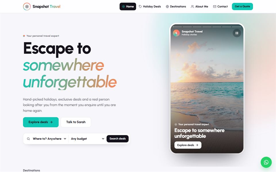
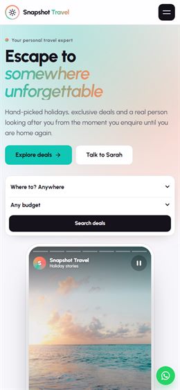
Social-media style: an Instagram-like stories viewer as the hero, destination highlight rings, deals as a feed of posts and a profile-card about section.
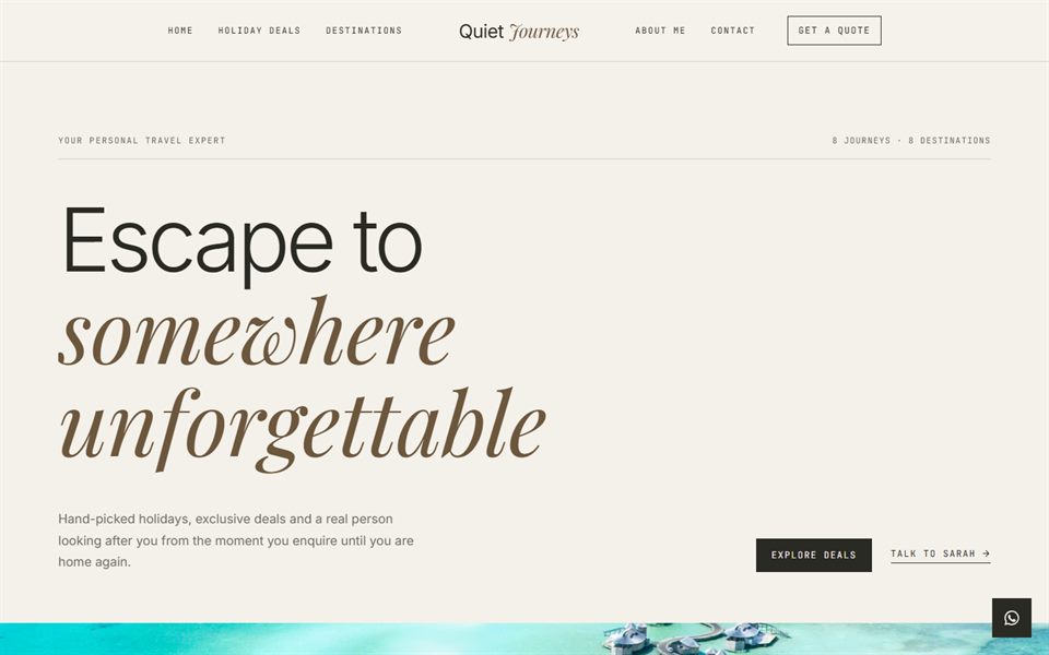
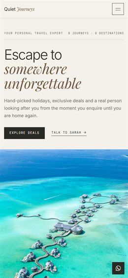
Quiet luxury: restrained and text-led, fine rules, light sans type with small mono labels, and deals laid out as an elegant numbered index.
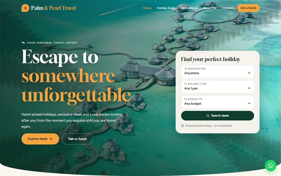
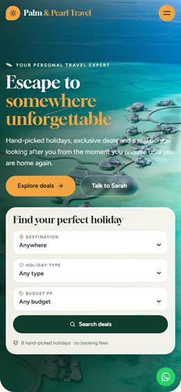
Tropical resort luxury: deep jungle green, palm-leaf shadows drifting across the photos, wide landscape deal cards and a booking card that floats over the hero.
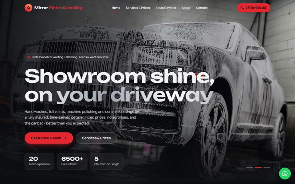
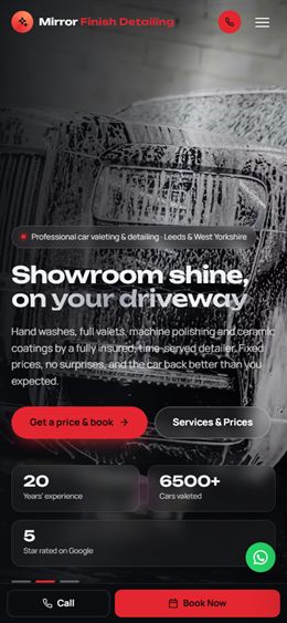
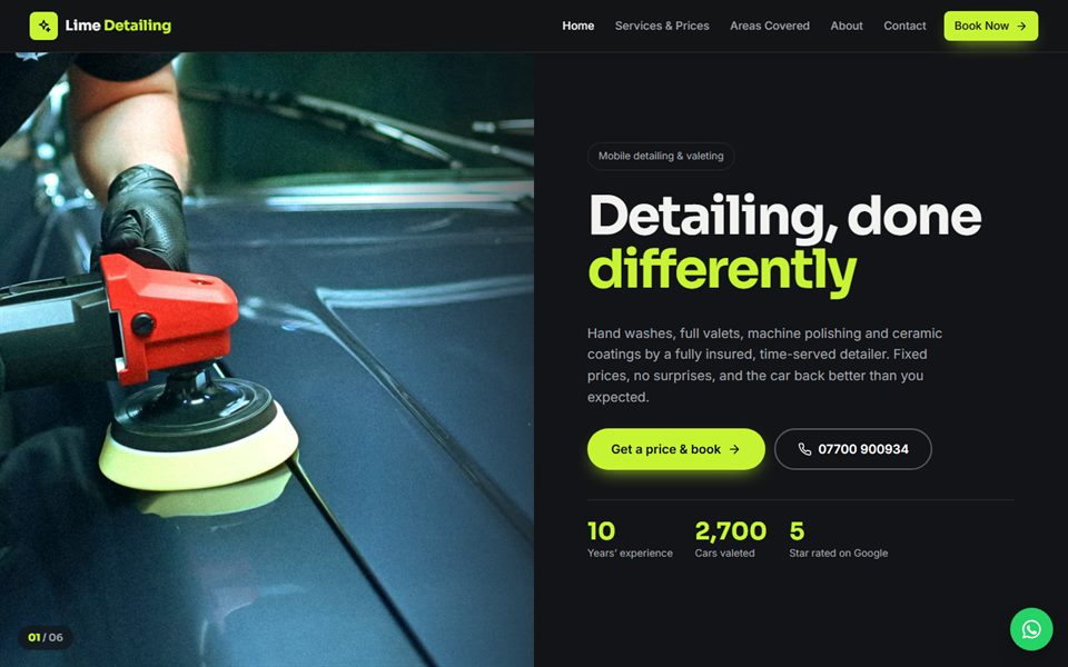
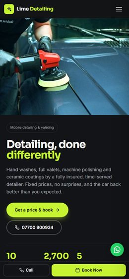
Dark, premium detailing: a studio light sweeps across a gleaming car, glossy reflections, a big before/after slider and tiered package cards.
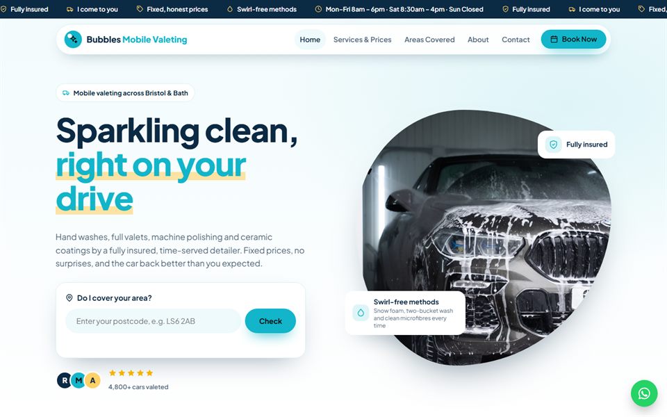
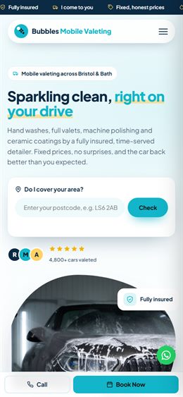
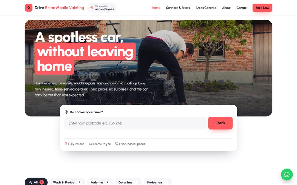
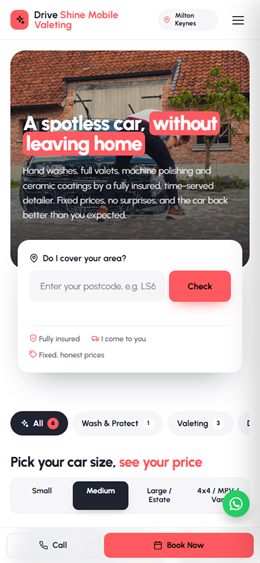
Bright and friendly mobile valeting: rising foam bubbles, a “Do we cover you?” postcode checker in the hero and a size-and-price picker.
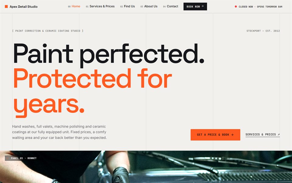
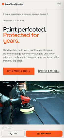
Technical detailing studio: spec-sheet layout, monospaced labels, a paint-correction process timeline and services as a numbered index.
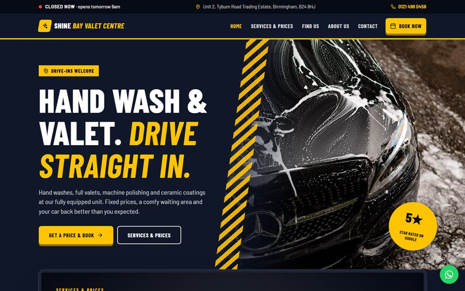
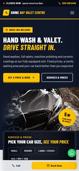
Bold valet centre / hand car wash: a lit-up price board, a live “Open now” sign, a drive-in map and big, simple buttons.
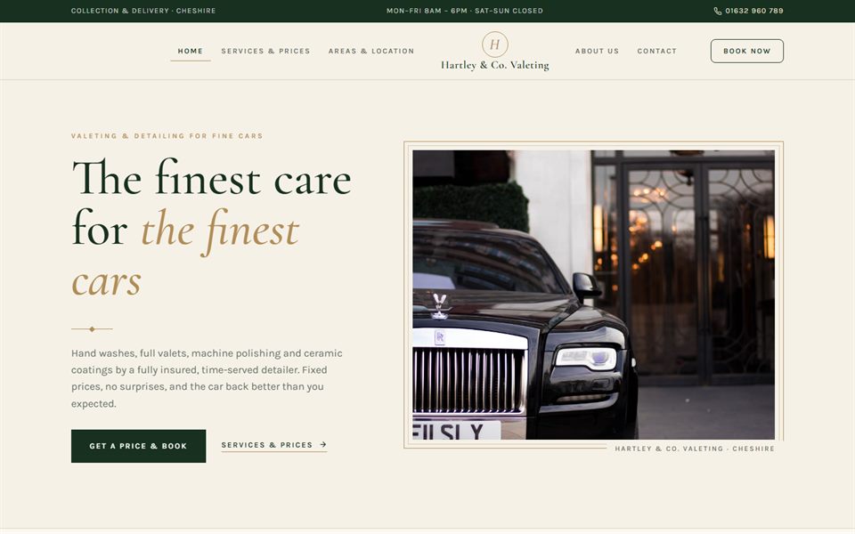
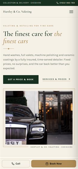
Quiet luxury for prestige cars: cream and racing green with brass details, elegant serif type, collection & delivery and care plans.
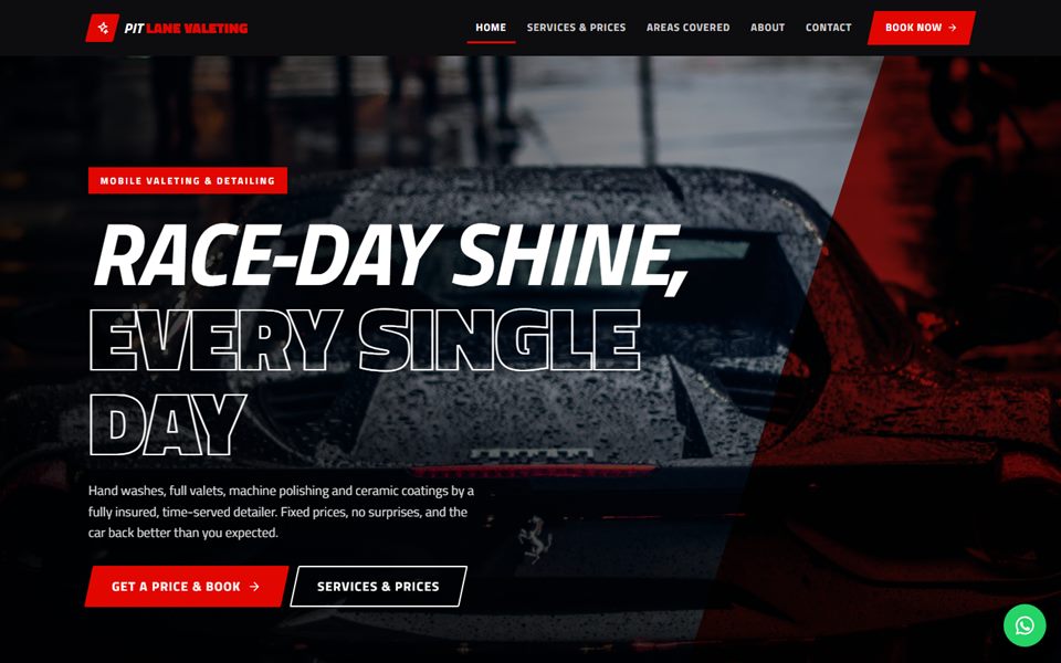
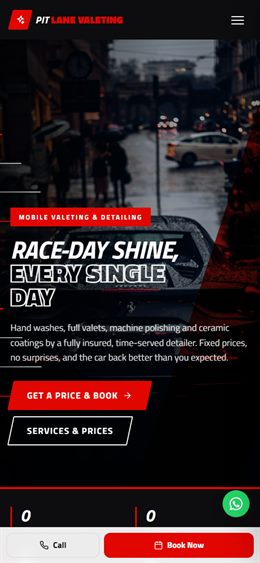
Motorsport energy: black, white and race red, slanted italic type, speed lines across a full-screen photo and services laid out like a pit board.
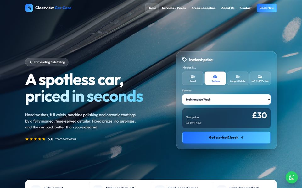
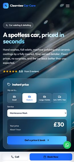
Bright and clean: a full-screen photo with an instant price calculator floating on frosted glass, zig-zag feature rows and a fresh blue palette.
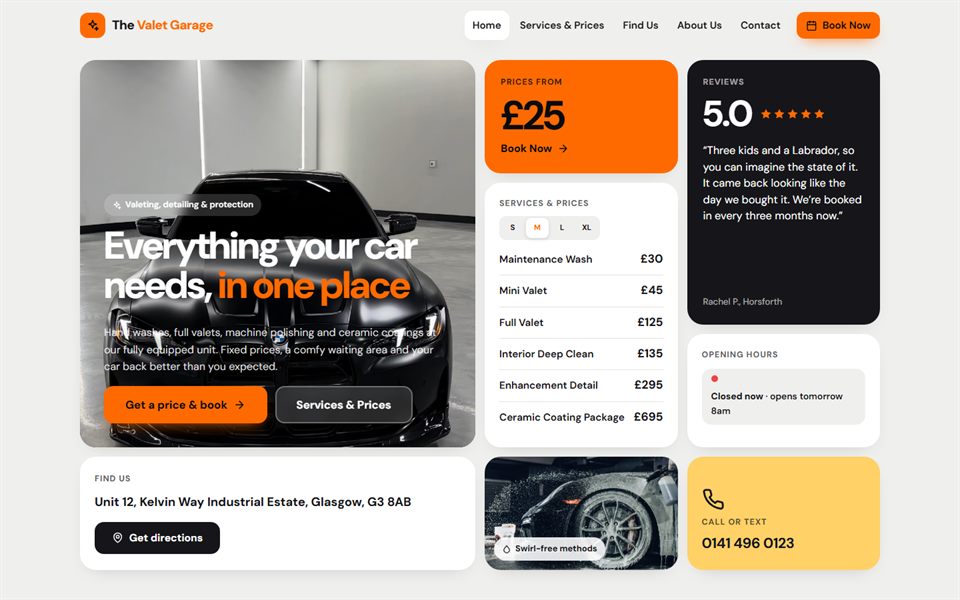
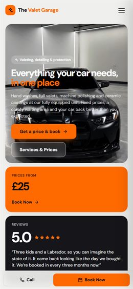
Modern tile grid: the homepage is a set of app-style tiles — photo, prices, opening hours, rating, postcode checker — that light up as you move over them.
Split screen in charcoal and lime: one half is a pinned photo that changes as you scroll the other half, with services as a clean price list.
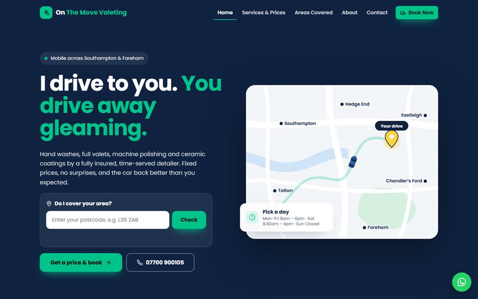
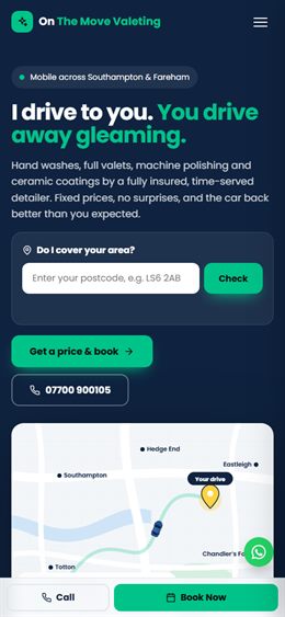
Made for mobile valeters: an animated map with the van driving to the customer’s pin, your towns on the map and a “Book → On my way → Done” timeline.
Delivery-app style for mobile valeters: a big “Enter your postcode” search, service cards like a menu, coral and white.
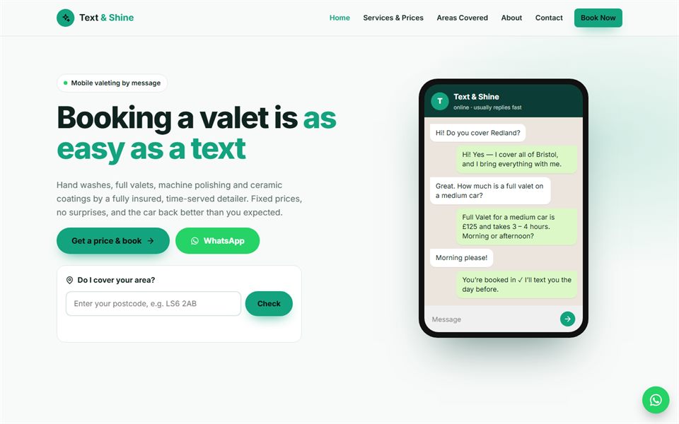
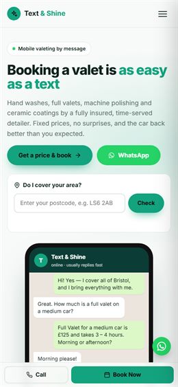
Booking feels like a text: a phone in the hero shows a WhatsApp-style conversation, with chat-bubble reviews and FAQs.
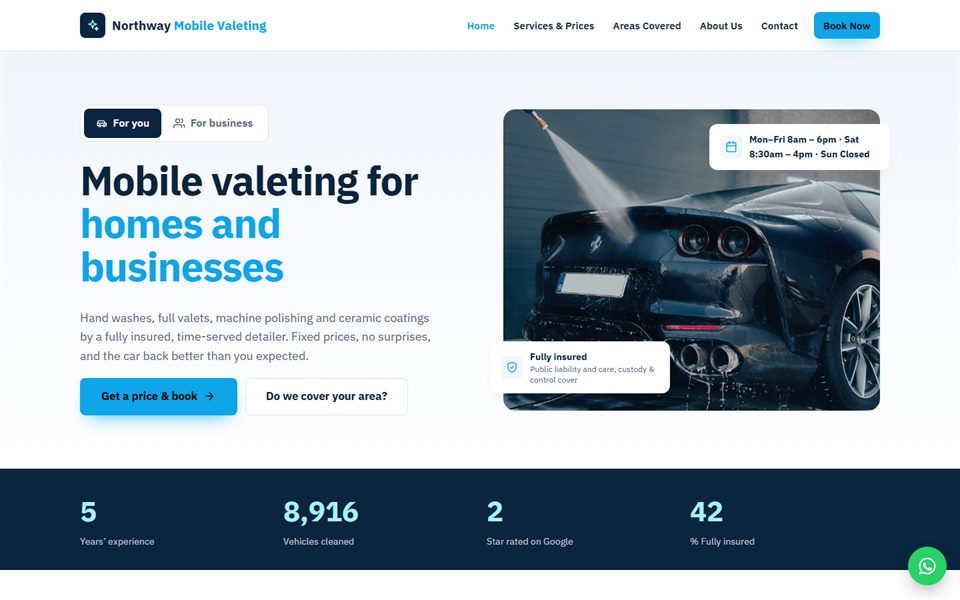
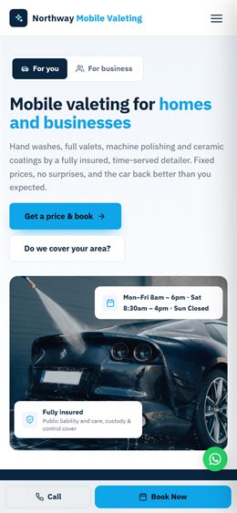
Homes and businesses: a switch between “For you” and “For business”, a fleet & company section and a crisp navy-and-sky look.
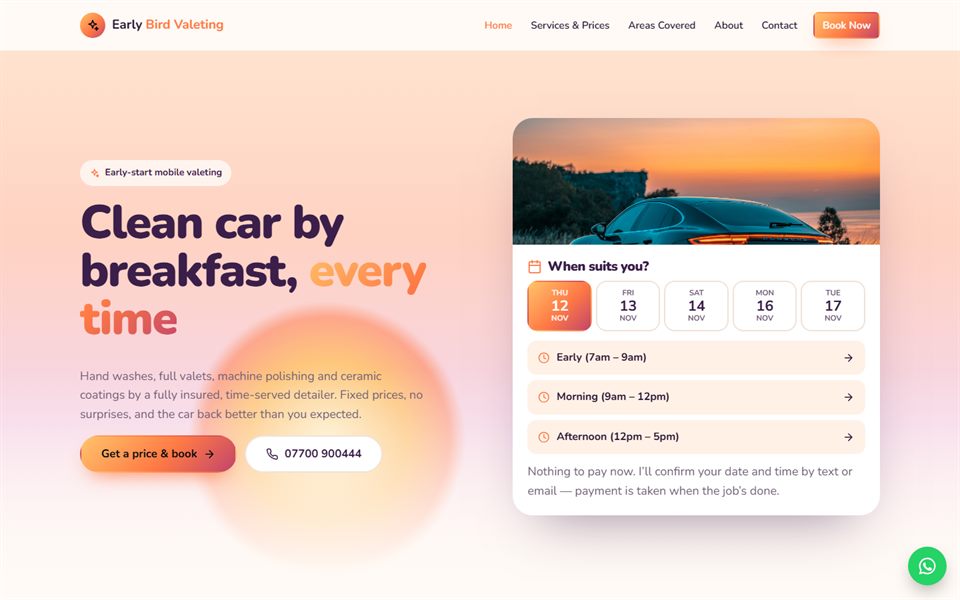
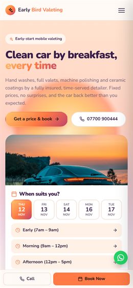
Warm and early: a soft sunrise gradient with the sun rising behind the headline and a “pick your time” panel.
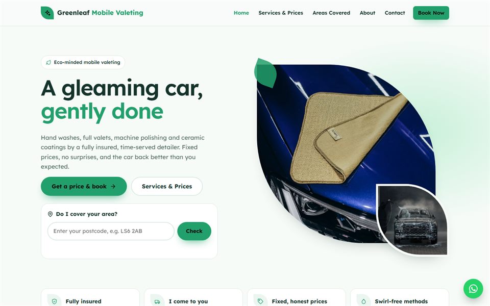
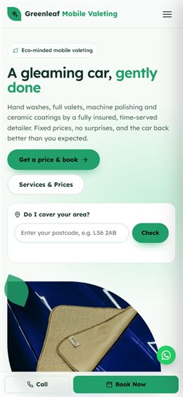
Fresh and green for eco-minded mobile valeters: mint tones, leaf shapes, rounded cards and a clean, light feel.
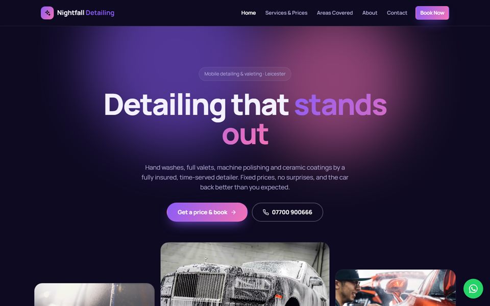
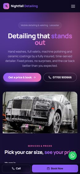
Dark violet and modern: services stack on top of each other as you scroll, with glowing gradient headlines.
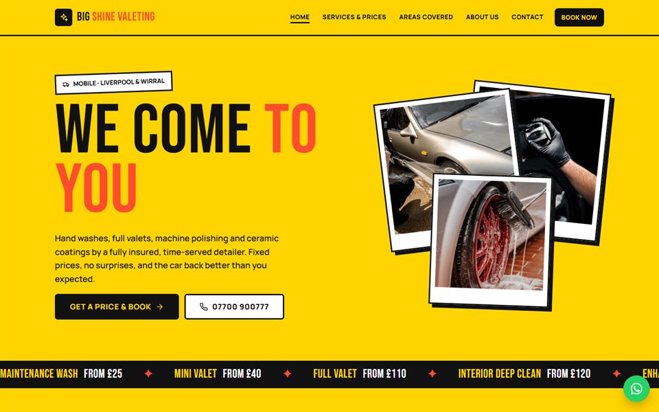
Loud and confident: bright yellow, huge black poster type, tilted photo prints and a scrolling banner.
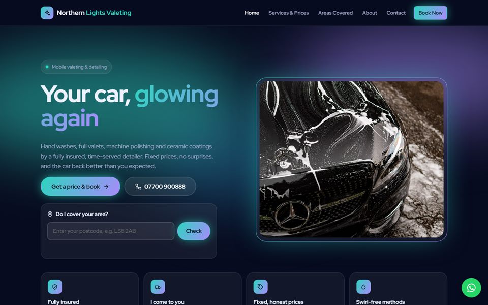
Night-time glow: deep navy with moving northern-lights colours, frosted glass panels and glowing edges.
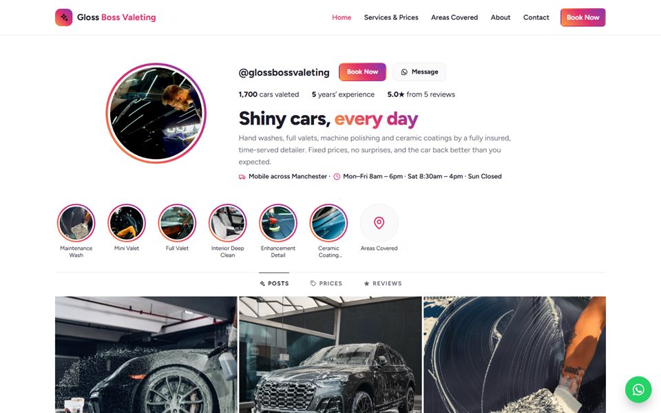
Instagram-style: a profile header, story circles for each service, a photo grid and reviews like comments.
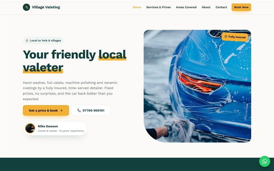
Your neighbourhood valeter: a big A–Z of towns covered, reviews by area and a friendly owner introduction.
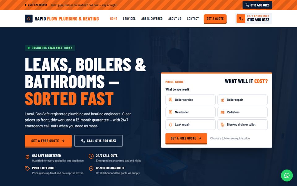
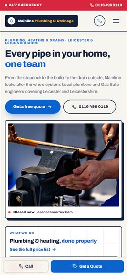
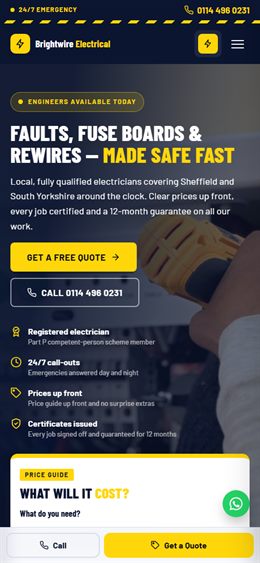
Emergency-first: a bright 24/7 call-out strip, a live “engineer available” hero with the price calculator right beside it, bold condensed type in navy and safety orange.
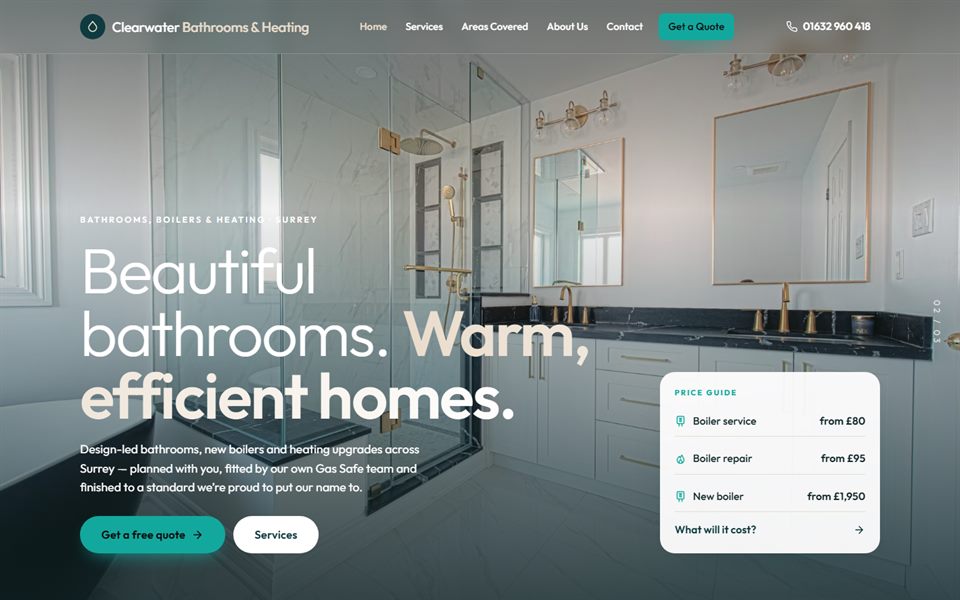
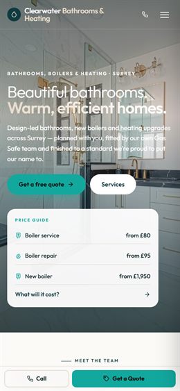
Photo-led and polished for bathroom & heating installers: full-screen bathroom photography, alternating service stories and a step-by-step “plan your project” estimator.
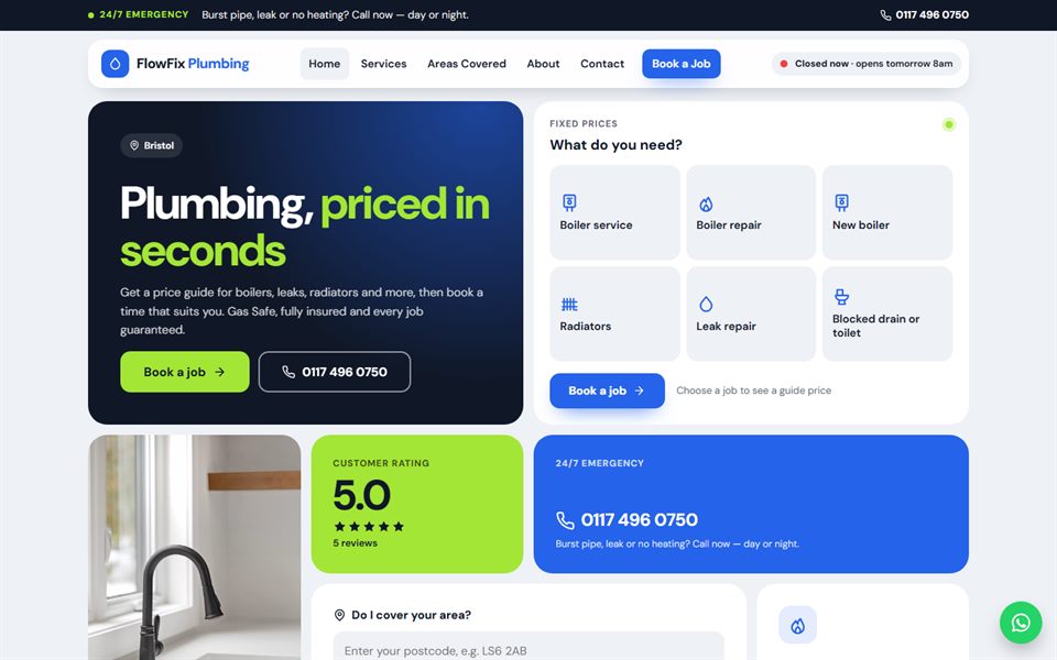
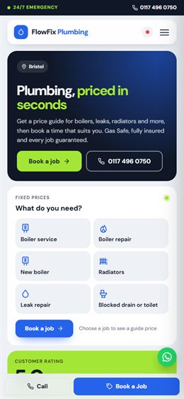
Modern app-style tile grid: the homepage is a set of rounded tiles — price guide, rating, availability, postcode checker, services — in crisp white, electric blue and lime.
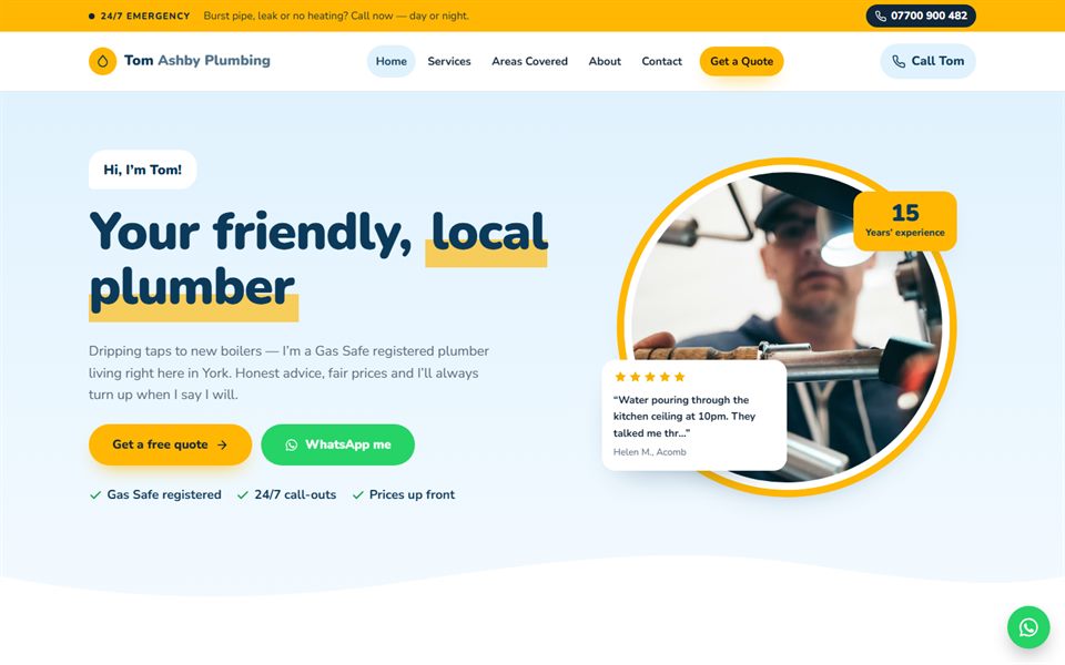
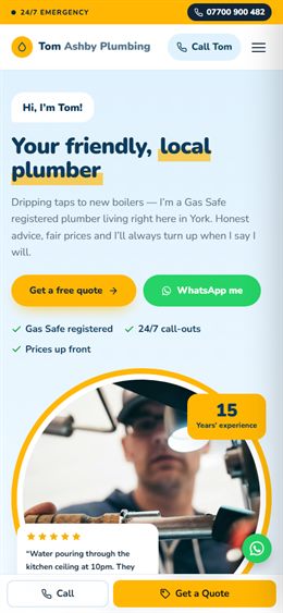
Your friendly local plumber: a warm owner introduction, a “what’s the problem?” picker, a chatty one-question-at-a-time price guide, wavy sky-blue bands and sunshine yellow.
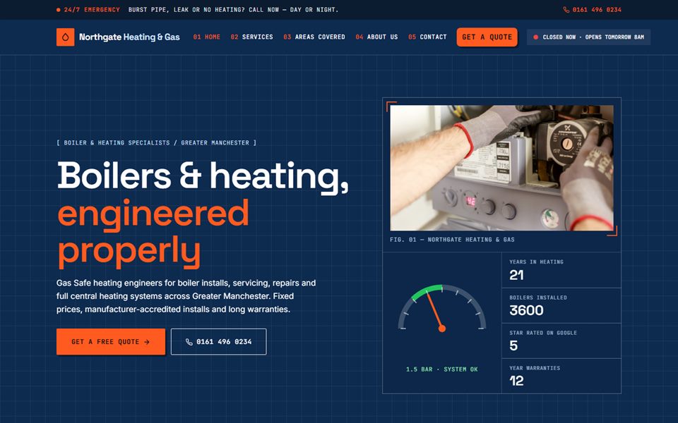
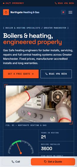
Technical heating & gas specialist: blueprint grid, monospaced labels, services as a numbered spec index and a quote that prints out like a till receipt.
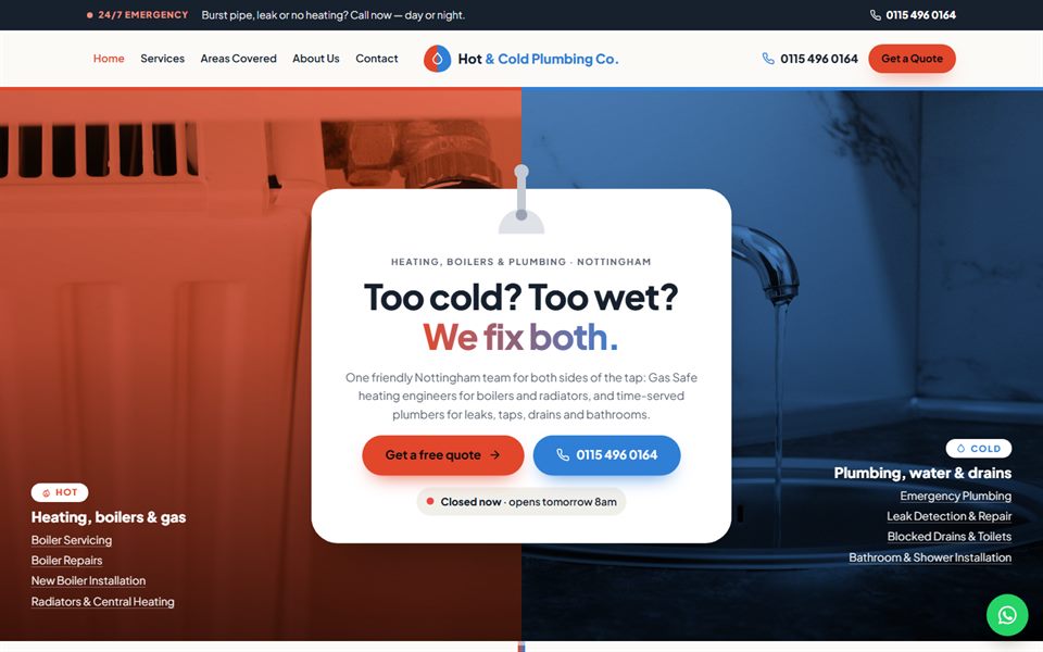
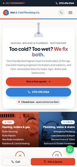
Hot and cold: the whole site is split into a warm red side for heating and boilers and a cool blue side for plumbing and water, meeting at a mixer tap. Visitors flip the lever to find their job.
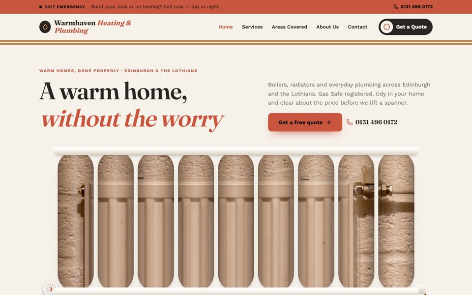
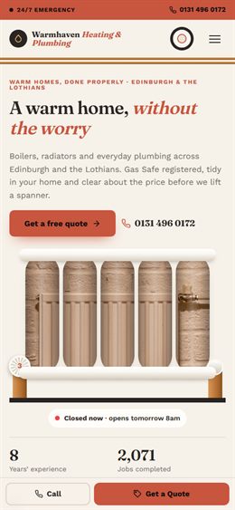
Built like a radiator: the main photo shows through a row of tall radiator columns, services sit on long finned panels and a thermostat valve dial sets how soon you need the work. Warm cream, charcoal and terracotta.
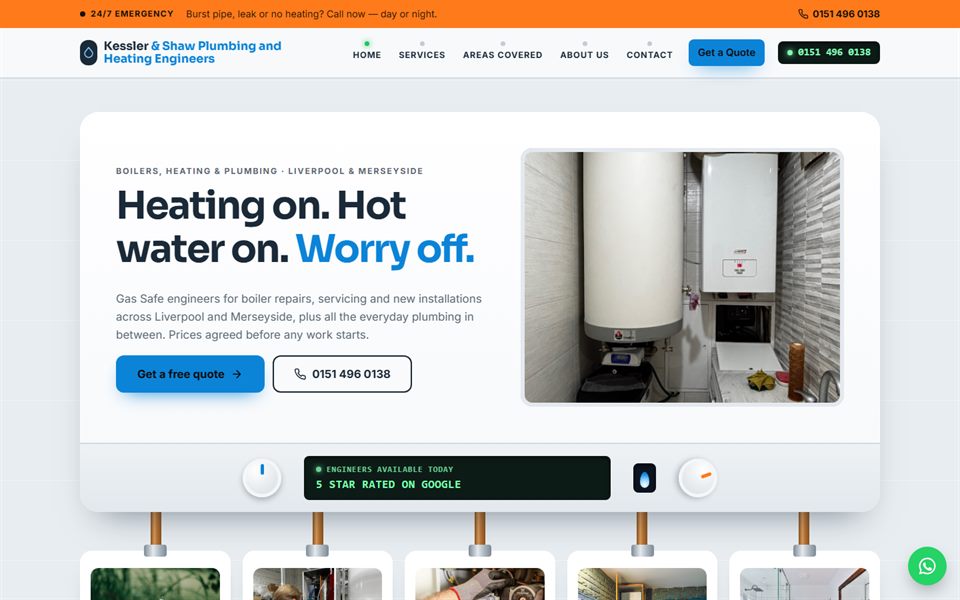
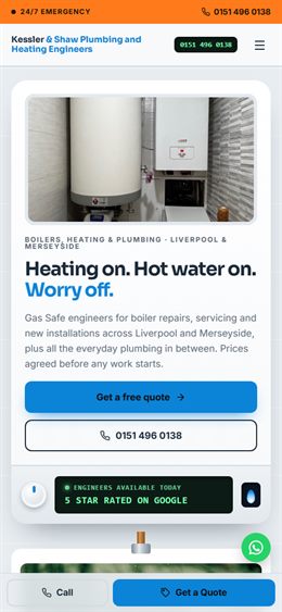
The boiler on the wall: the home page is a boiler casing with a lit display and controls, and five pipes run down from it into the main services. The price guide works like the boiler’s own control panel.
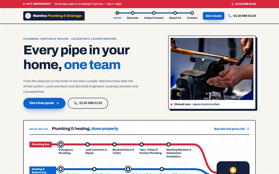
A pipe map of everything you do: each kind of work is a coloured line and every service is a stop on it, like a transport map. Clear, graphic and easy to scan, with a pick-a-line price guide.
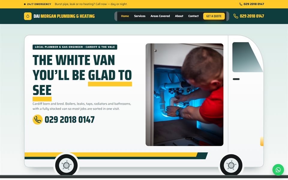
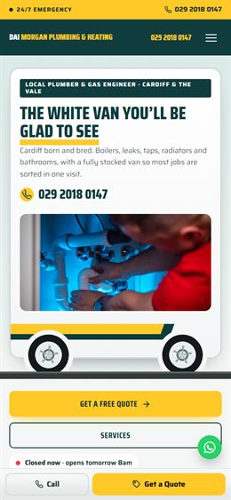
Your van as your website: the home page is the side of a signwritten van, services are stocked in the racking bins inside and the footer is the rear doors. Visitors load the jobs they need into the van for one guide price.
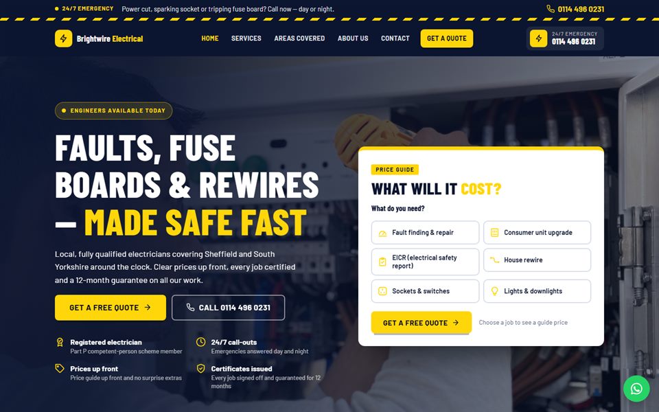
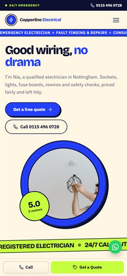
Emergency-first: a bright 24/7 call-out strip, a live “electrician available” hero with the price calculator right beside it, bold condensed type in deep navy and electric yellow.
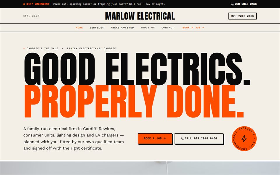
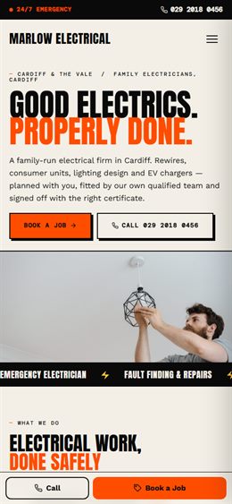
Editorial and bold: a poster-style masthead with giant type, services as a numbered index, a huge guide-price ticket and a signal-orange accent on warm paper.
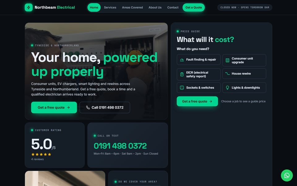
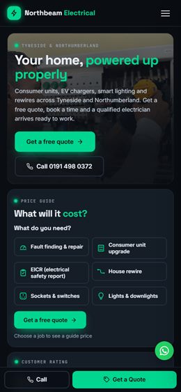
A homepage laid out like a consumer unit: dark slate, glowing green “power on” LEDs, services as a row of breaker switches and a bento grid of price, rating and coverage tiles.
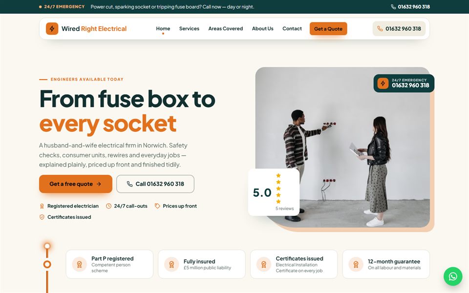
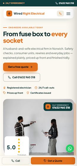
One continuous copper wire runs down the whole page, connecting each stop — price, services, how it works, reviews — like a circuit. Calm cream and deep teal with copper highlights.
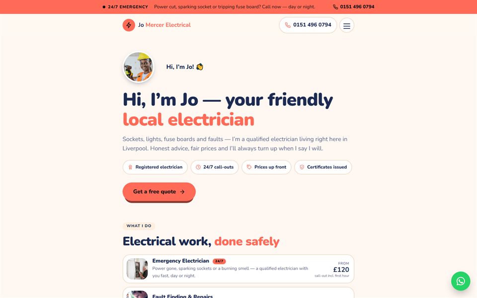
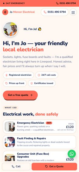
Your friendly local sparky: a full-width conversation that starts with a personal hello on one side and “what do you need?” replies on the other, with a chatty one-question-at-a-time price guide, in indigo, coral and peach.
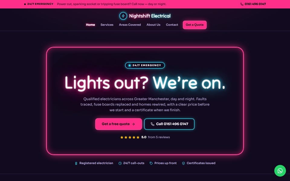
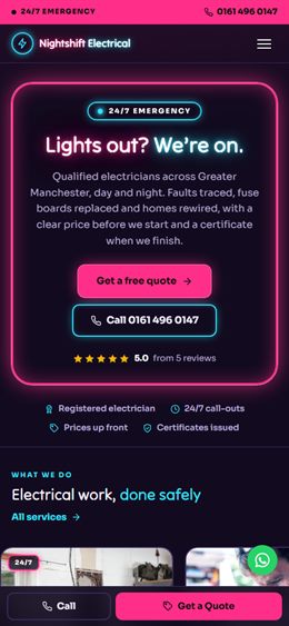
A night-time sign wall: the headline glows like a neon tube sign, with no hero photo, above a wall of glowing sign cards for each service. Aubergine black, hot pink and cyan.
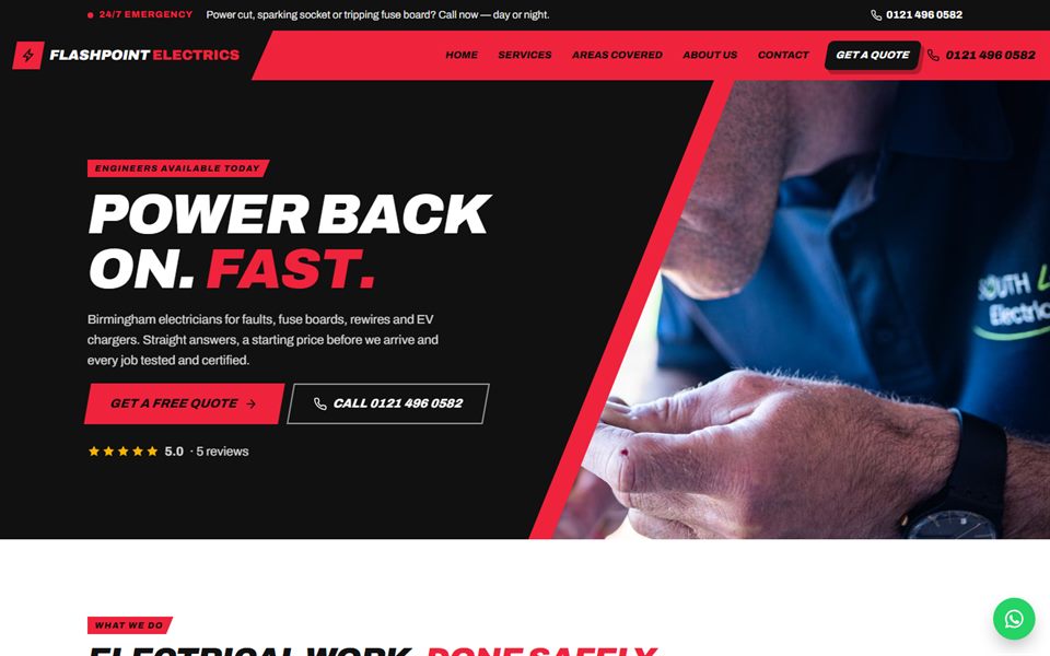
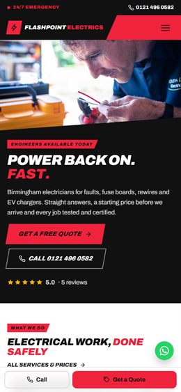
Everything on the slant: a full-width photo cut by a lightning-angle wedge, sections sliced diagonally and services as a stack of slanted strike bars. Signal red, black and white with heavy italic type.
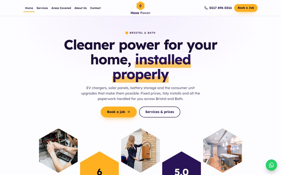
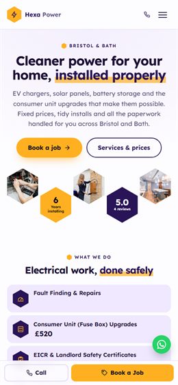
A honeycomb: hexagon photos and stats across the hero and every service as an interlocking hexagon cell. Deep violet, honey amber and soft lilac, made for EV, solar and battery installers.
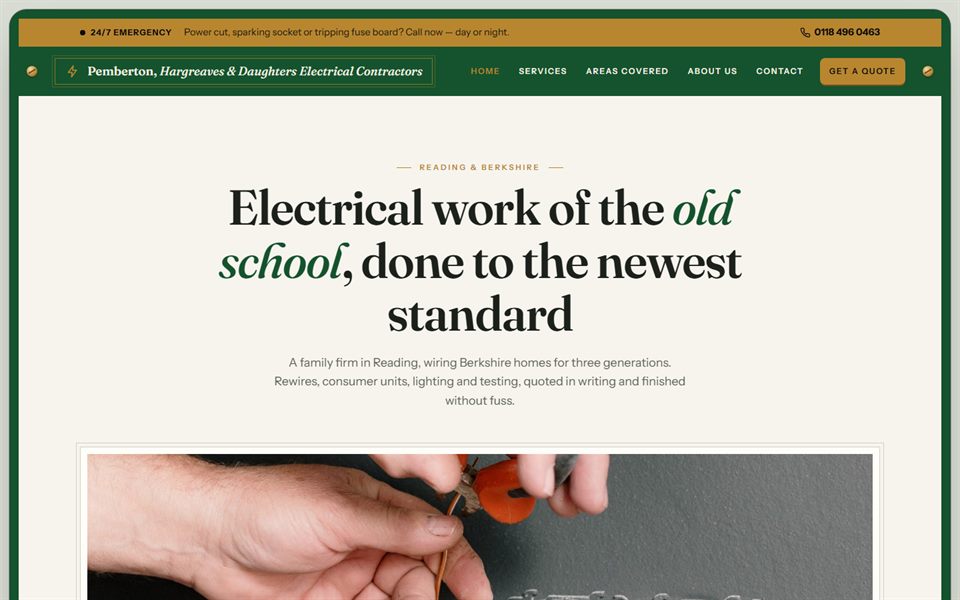
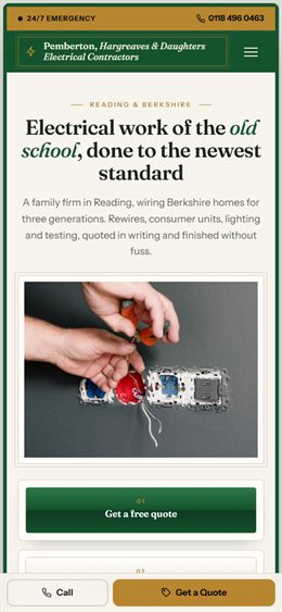
The whole page is one wide switch plate with brass screw corners: a big serif headline, an edge-to-edge panoramic photo with rocker switches mounted on it, with prices in a ruled ledger. Porcelain, racing green and brass.
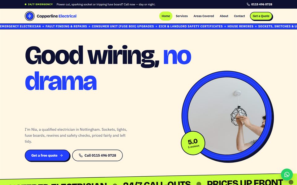
Bands of oversized running type roll across the page like cable off a drum, with a round cable-drum photo, circular service pictures and sticker-style reviews. Cobalt blue, lime and cream.
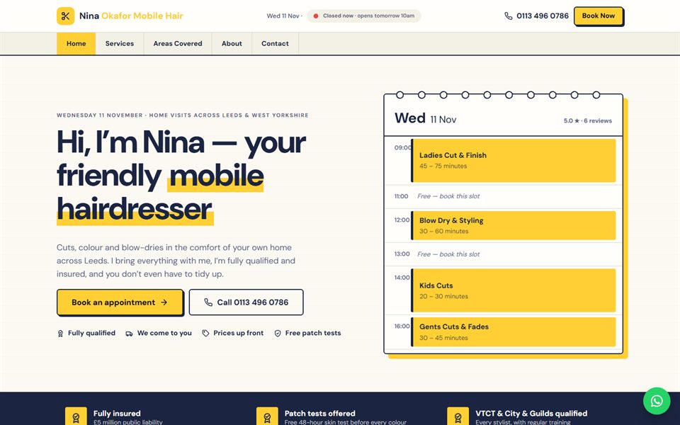
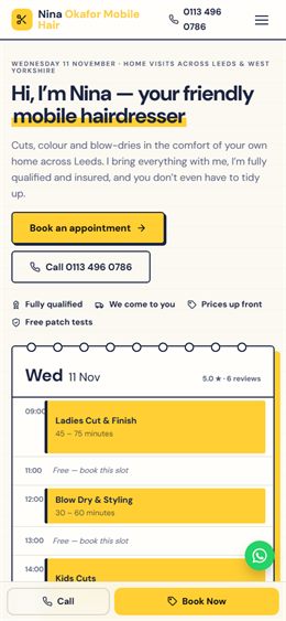
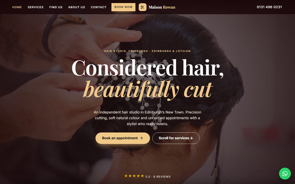
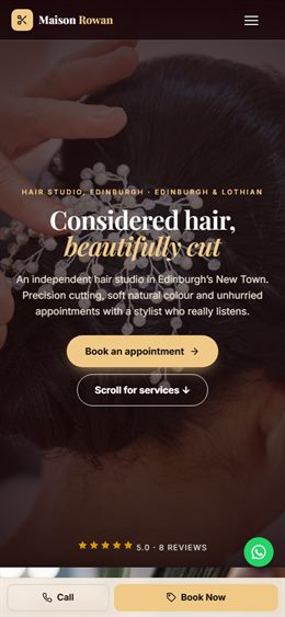
The appointment book: a ruled, ring-bound day sheet with highlighter-yellow bookings, services as timed entries and a diary page right in the hero. Navy ink on warm paper. Great for mobile and independent stylists.
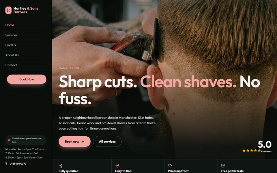
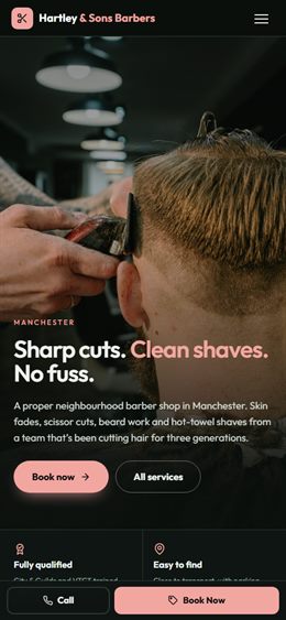
A fixed side rail holds the logo, menu, hours and Book button while the page scrolls beside it; services run along a swipeable strip of tall photo cards. Deep green-black with blush pink. For barbers and modern salons.
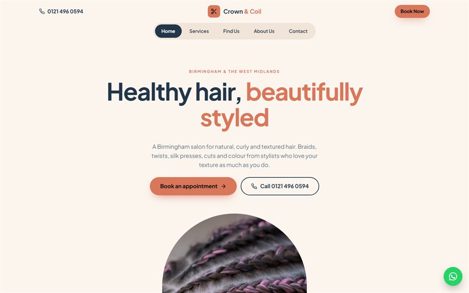
Soft arched windows frame the photos, and services sit in category tabs of arch-topped cards. Dusty navy, terracotta and cream. Calm and welcoming, ideal for natural and textured hair specialists.
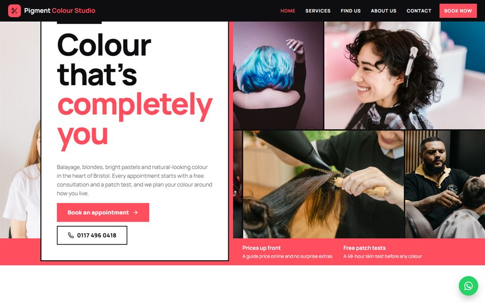
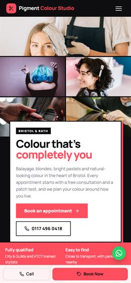
A photo wall: a mosaic hero and a masonry grid of full-bleed service photos with a scrolling reviews strip. Crisp black and white with a hot coral accent. Made for colour studios and creative salons.
Full-screen panels that stack over each other as you scroll, one for each kind of service, with big type and a photo for each. Oxblood, gold and cream. Luxurious, for high-end salons.
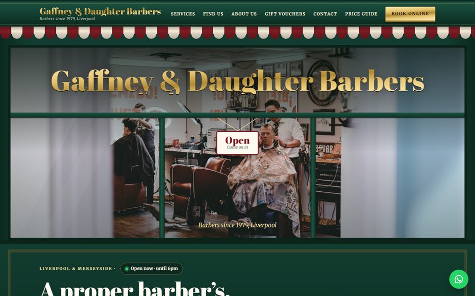
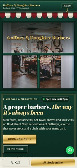
The shopfront: a striped awning that rolls down as the menu, gold-leaf lettering on the shop window, a hanging Open/Closed sign, services as hand-lettered window cards and a pavement A-board footer. Bottle green, oxblood and gold leaf. For traditional barbers and neighbourhood salons.
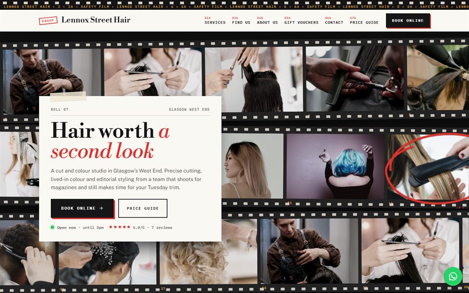
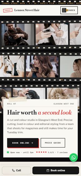
A photographer’s contact sheet: frames on black film strips with sprocket holes and frame numbers, the best shots circled in red china marker, services as numbered frames and a menu that drops down like a strip of film. Charcoal, paper white and marker red. For editorial cut and colour salons.
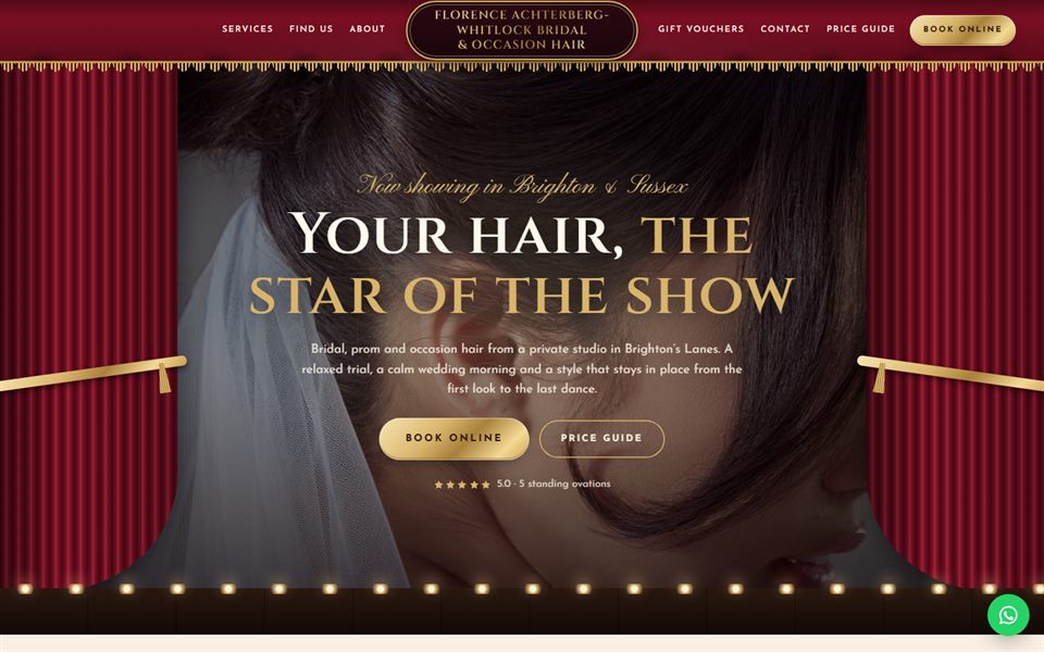
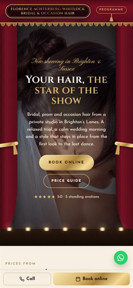
Opening night: velvet curtains part across the hero, footlights glow, the page runs like a theatre programme in acts, services are the cast list, reviews are the notices and the menu drops the curtain over the page. Velvet crimson, gold and ivory. For bridal and occasion hair.
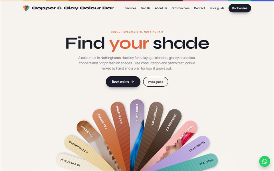
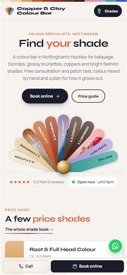
A colourist’s swatch fan: hair-colour strips fan out from a brass rivet in the hero, services are swatch strips with shade numbers, the menu fans open from the corner and the price guide picks a shade. Ink, copper and a full spectrum of colour. For colour bars and colour specialists.
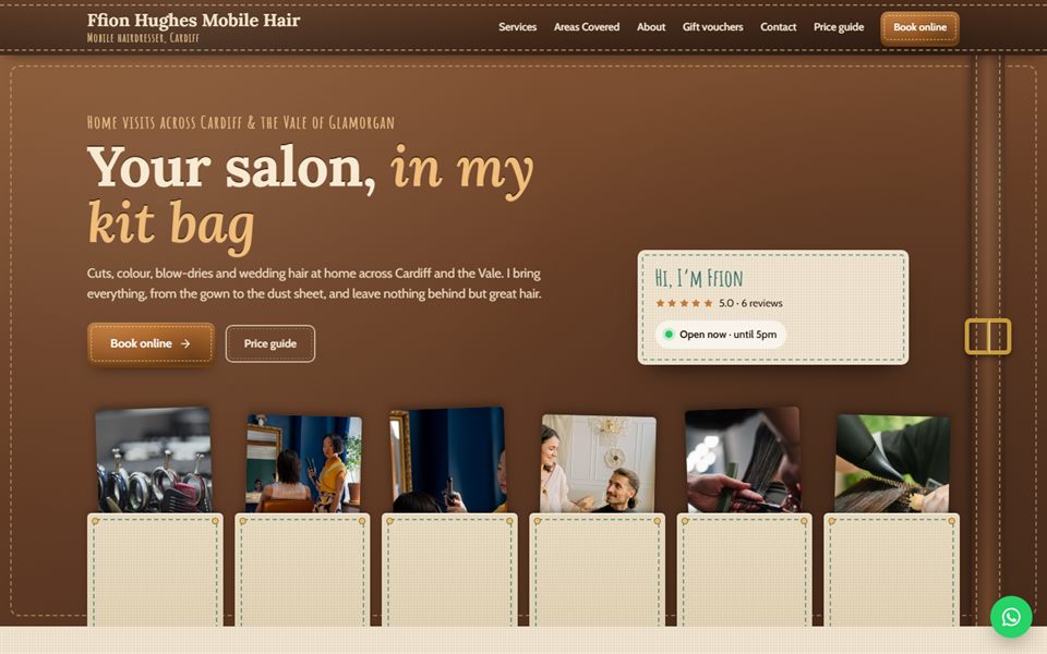
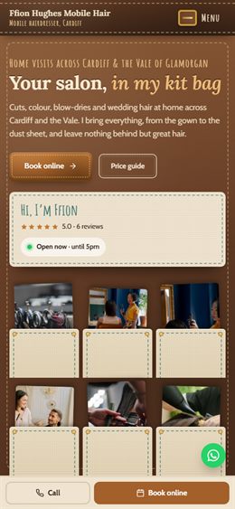
A mobile hairdresser’s leather tool roll: stitched leather and canvas, services tucked into pockets with brass studs, a strap-and-buckle menu that unrolls the links, a kit-list price guide and a map of the towns covered. Saddle tan, canvas and thread teal. For mobile hairdressers.
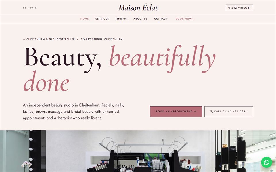
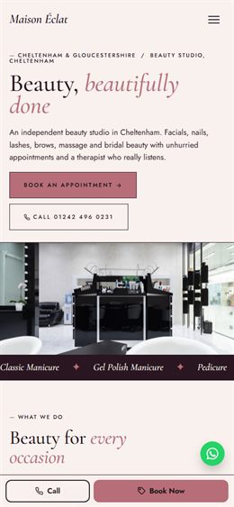
Luxury beauty studio: a centred masthead with giant italic serif type, treatments as a numbered price menu, a signature ticket-style price guide and rose gold on aubergine and blush ivory.
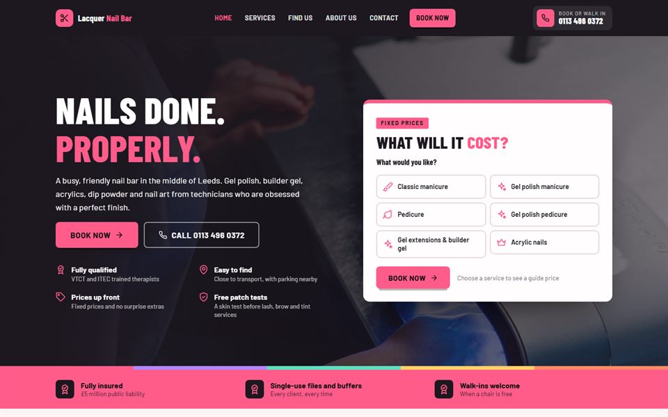
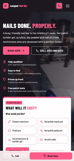
The nail bar: charcoal and hot pink with a nail-polish colour stripe, a colour-chart price menu, a split hero with the price guide right beside it and bold condensed type. Great for nail bars and busy salons.
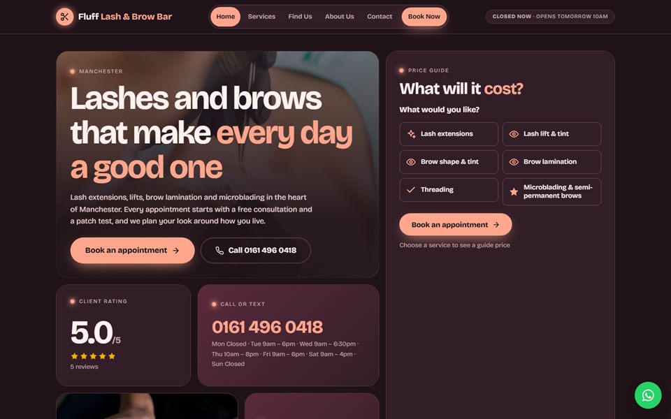
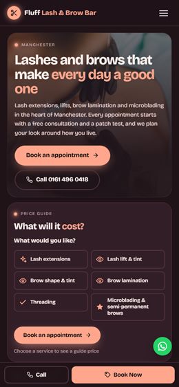
The beauty bar: a bento grid of glowing tiles for treatments, price, rating and location, on deep plum with peach highlights and playful type. Ideal for lash, brow and skin bars.
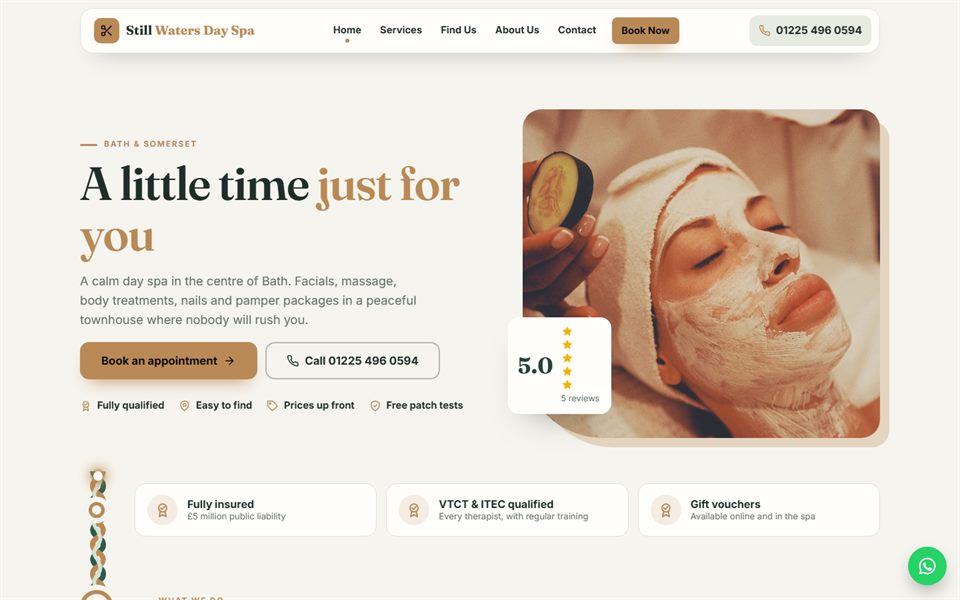
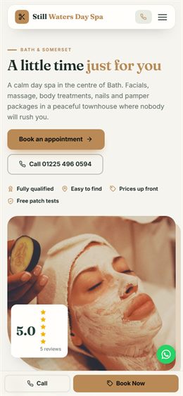
The spa sanctuary: a flowing ribbon runs down the whole page, connecting each stop — price, treatments, how it works, reviews. Sage, sand-gold and cream with rounded photo cards. Made for spas and wellness-led salons.
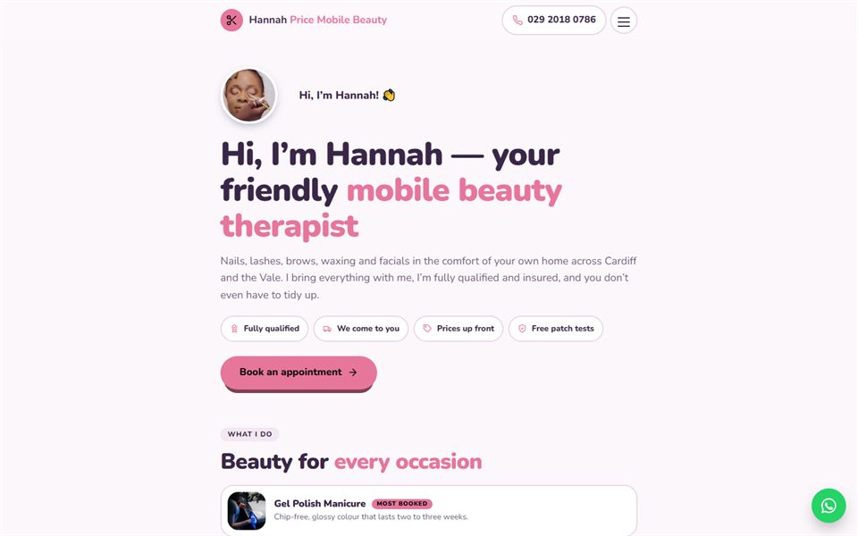
Your friendly local beauty therapist: one warm, narrow column that starts with a personal hello and a chatty one-question-at-a-time price guide, in plum, rose and lilac cream. Perfect for mobile and independent therapists.
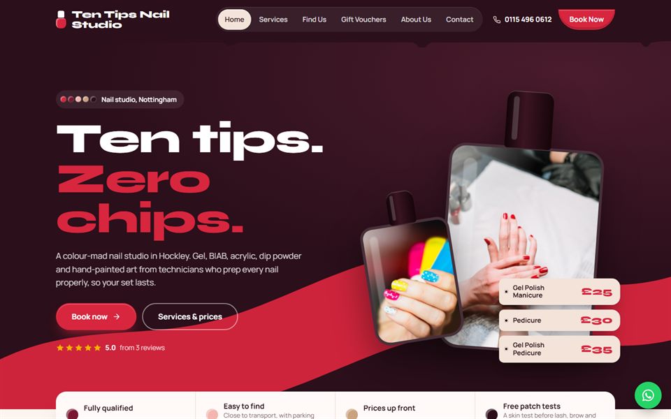
The nail studio: a giant brush-stroke of lacquer sweeps across the page behind a polish-bottle photo window, treatments sit in bottle-shaped cards and the price tool is a shelf of bottles that fill with colour. Black cherry, lacquer red and nude.
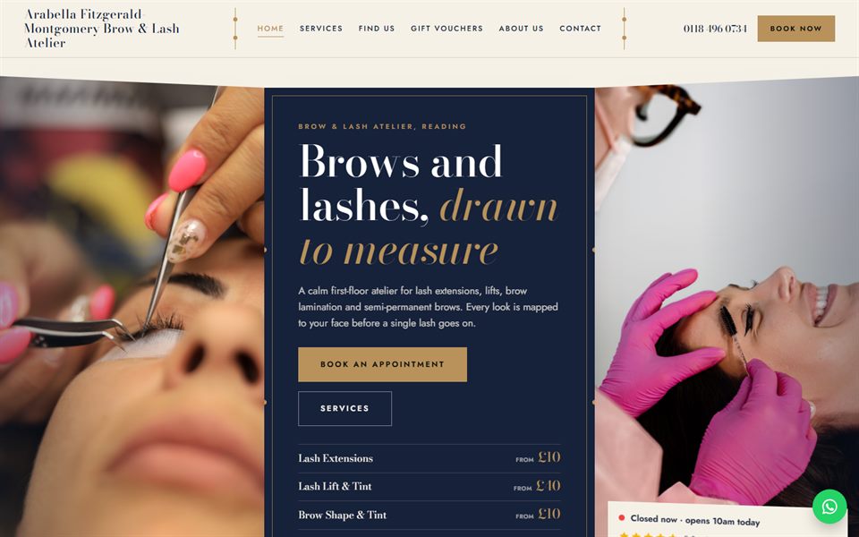
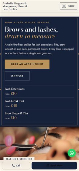
The lash and brow atelier: the page opens as a three-leaf dressing screen, sections unfold panel by panel, the menu swings shut like a screen and the price tool folds back one leaf at a time. Ink navy, antique gold and ivory.
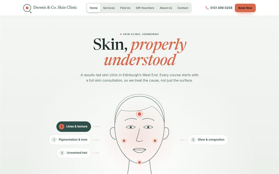
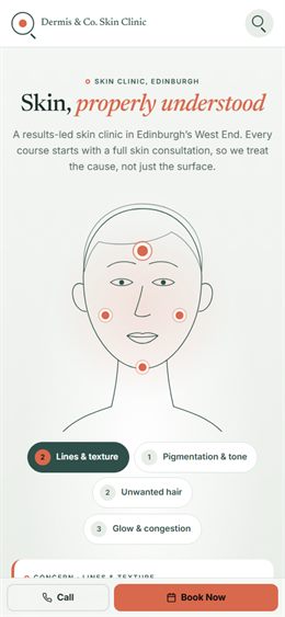
The skin clinic: a line-drawn face map with labelled zones leads straight to the right treatments, clinical-note cards, a magnifying-lens menu and a price tool written out like a treatment plan. Sage, coral and porcelain.
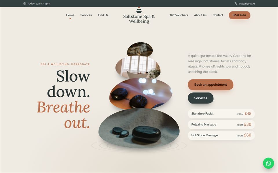
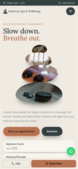
The spa retreat: a balanced stack of pebble-shaped photos, sections that step down the page like smooth stones, a menu that rises from the bottom like a pebble and a price tool that builds a little cairn. Slate, clay and limestone.
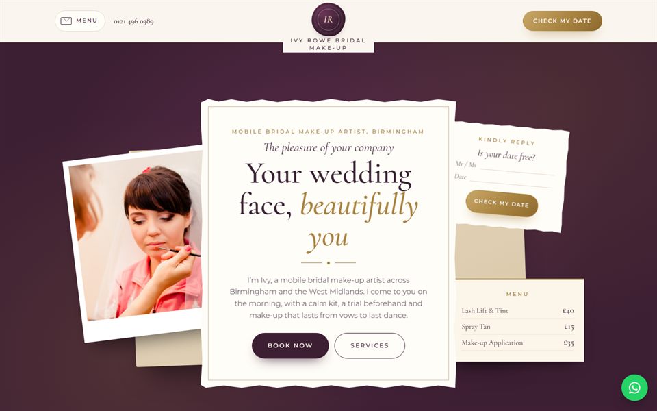
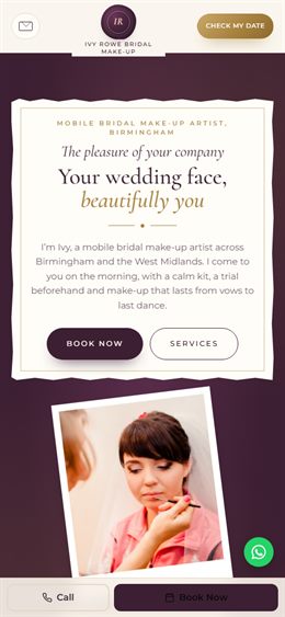
The bridal make-up artist: a layered wedding stationery suite with an invitation, RSVP card and menu card, a wax-seal monogram, an envelope menu and a fill-in-the-blanks RSVP price card. Deep plum, champagne and paper.
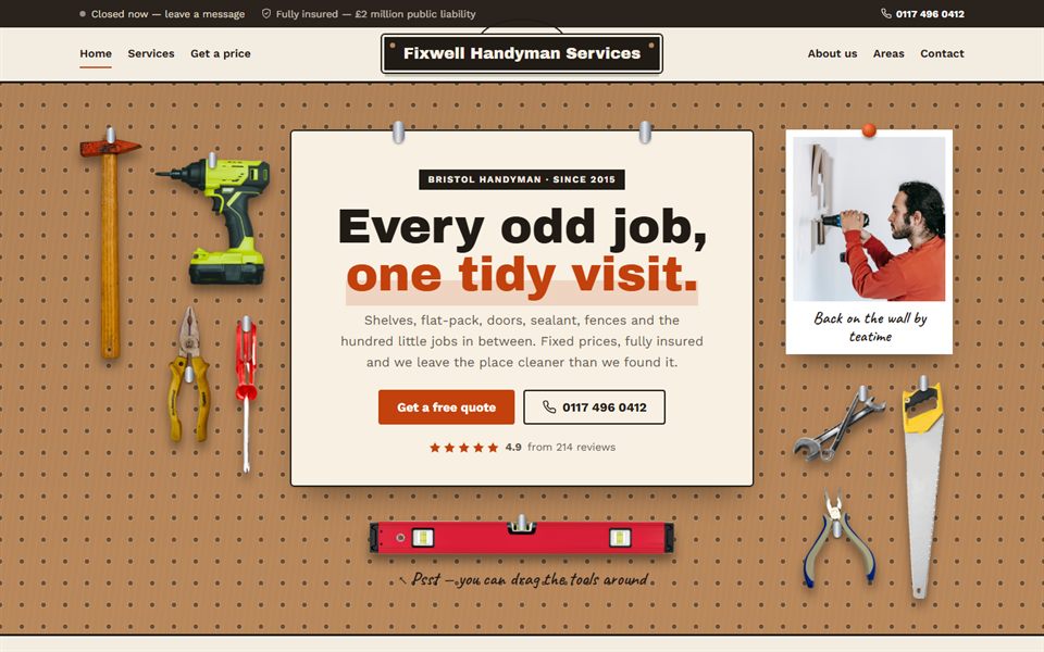
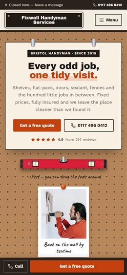
Workshop pegboard: services hang as tags on a perforated board, hanging-sign header, workbench footer. Price guide = build your fix-it list.
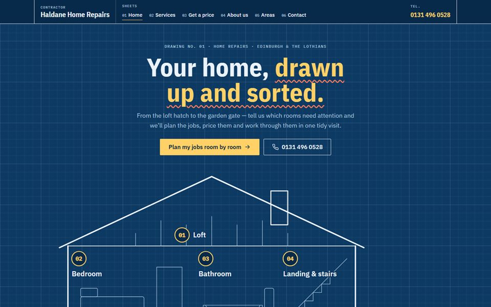
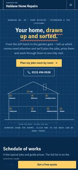
Architect's drawing: blue grid paper, a line-drawn house with callouts, title-block footer. Price guide = pick a room on the plan.
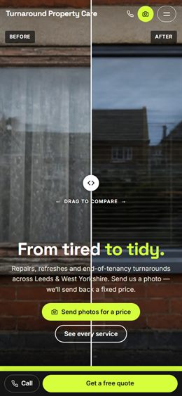
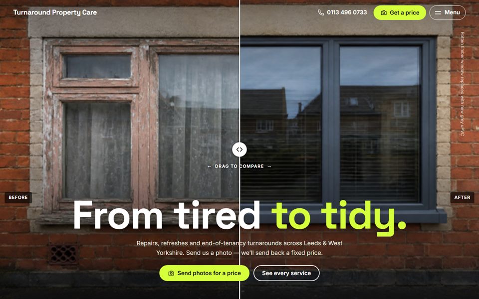
Before & after first: a full-screen drag-to-compare hero and case studies. Price guide = send photos for a fixed quote.
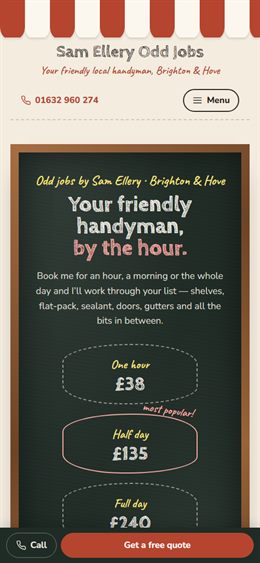
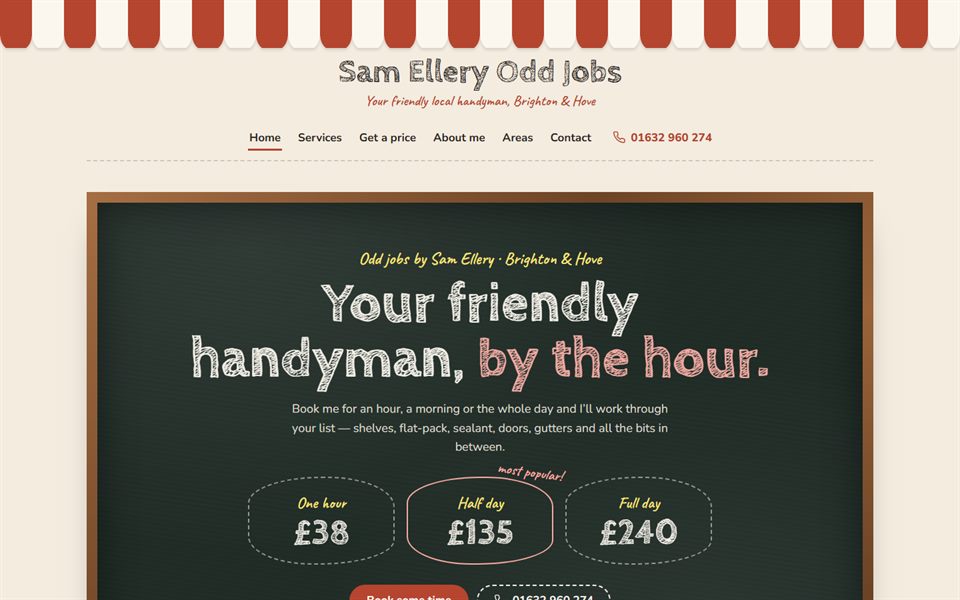
Café-style menu board for a one-person handyman: chalk lettering, today's specials, a price menu. Price guide = how many hours do you need?
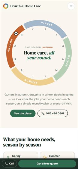
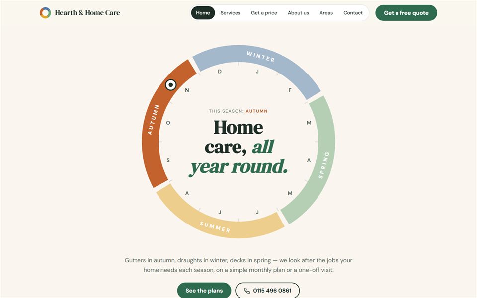
Home care through the year: a year wheel, seasonal jobs and monthly maintenance plans. Price guide = choose a plan or a one-off visit.
Photo-led and premium: an overlapping photo pair in the hero, a proof bar, a photo stage that changes with each kind of job, photo price cards and a call-back form over a full-width photo. Price guide = plan a visit and fill it with jobs.
Photo-led with real motion: a full-screen photo hero whose headline rises in with a changing word, photo strips gliding in opposite directions, numbers that count up, kinds of job that slide sideways as you scroll, price cards that tilt under the mouse and a line that draws itself through the steps. Price guide = rate each job simple, typical or awkward.
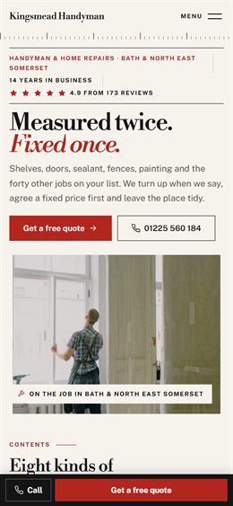
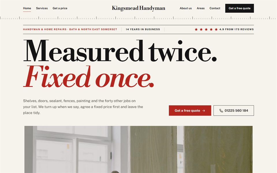
Editorial and photo-led: a headline the width of the page, a work photo that opens out to full width as you scroll, a contents list of jobs where a photo follows the mouse, a price index with dotted leaders and a tape-measure rule under the header. Price guide = measure up (length × width, a length or a count).
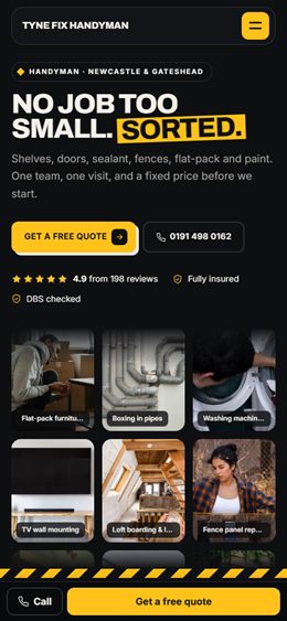
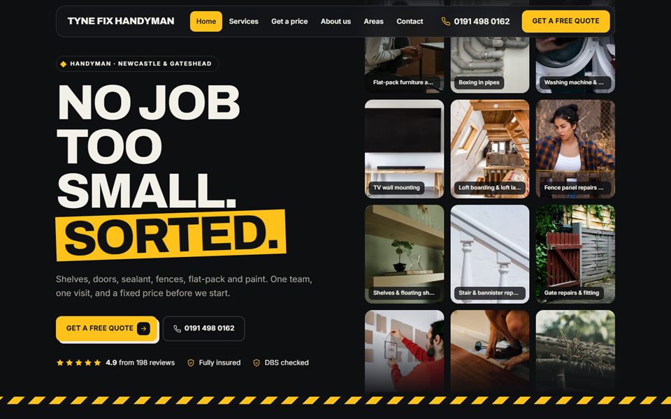
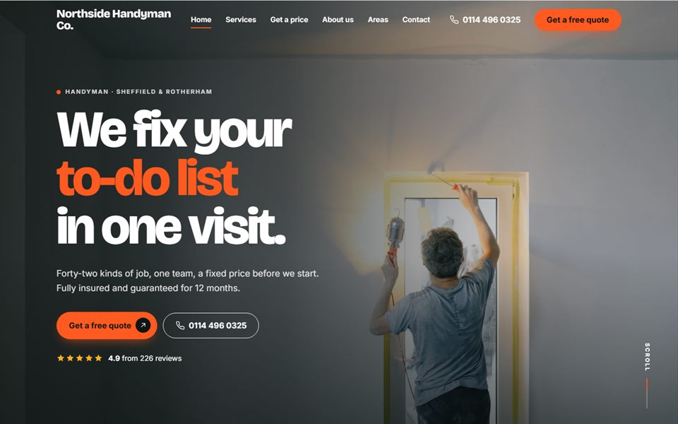
Dark and bold with site-yellow: three columns of work photos that glide past each other in the hero, a hazard-stripe band, a photo mosaic of the kinds of job, step cards that stack as you scroll and a floating pill menu. Price guide = tap a photo once for each job.
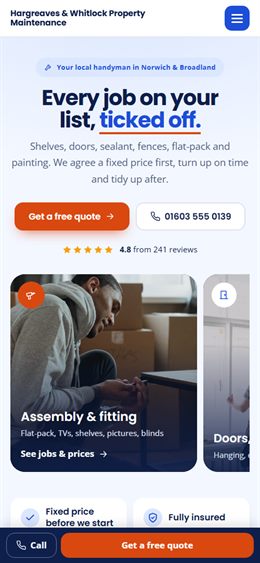
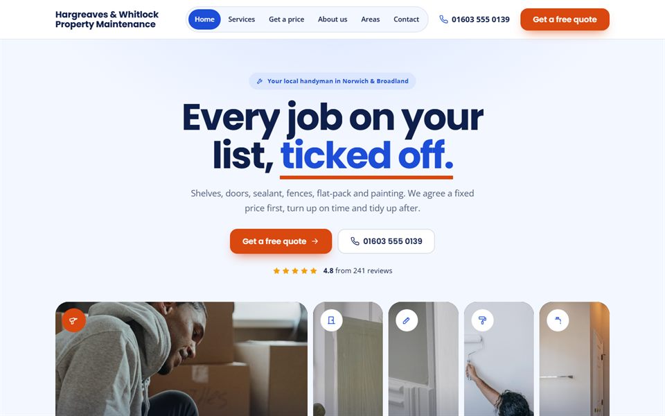
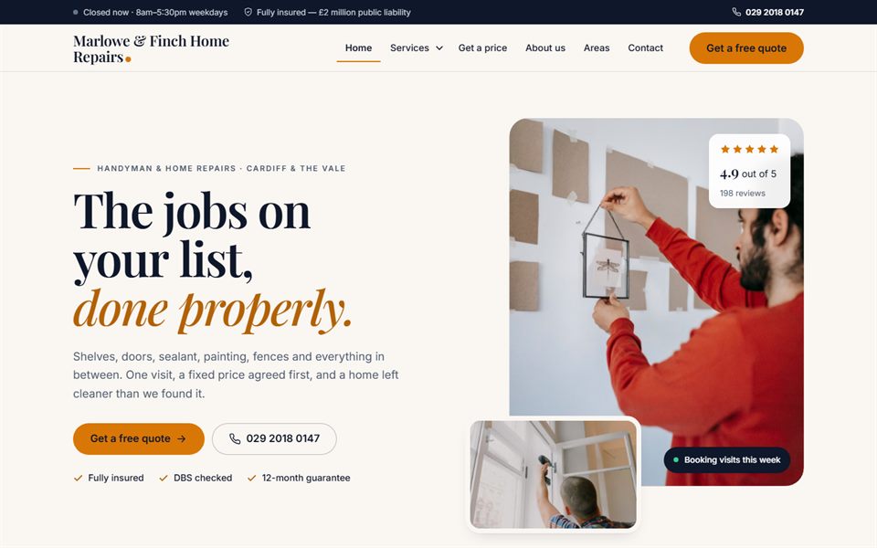
Bright and friendly in blue and orange: a row of tall photo panels that open as you point at them, round tool icons for each kind of job, a timeline that draws itself down the page and photo price cards with a price tag. Price guide = three steps: kind of job, the job, how many.
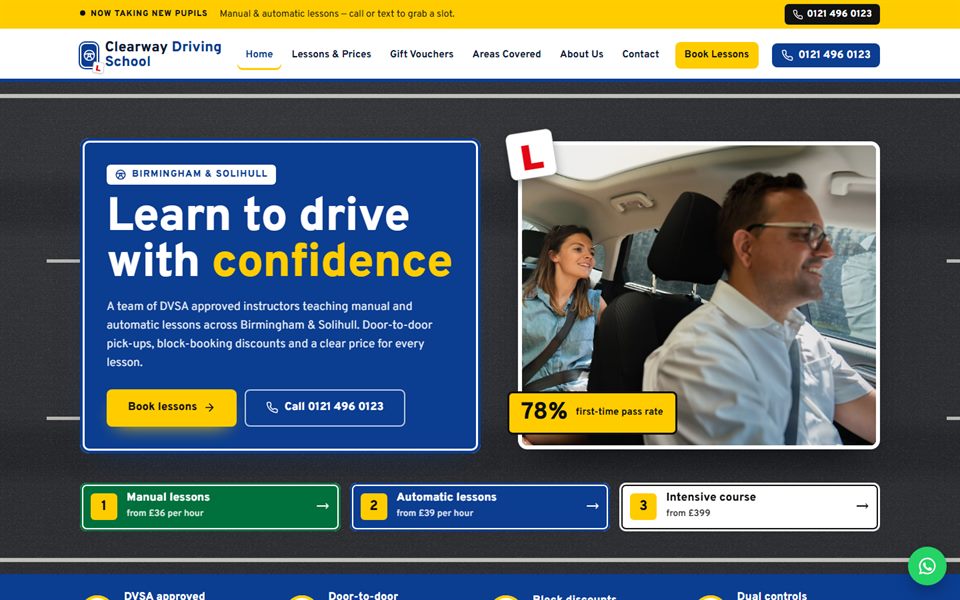
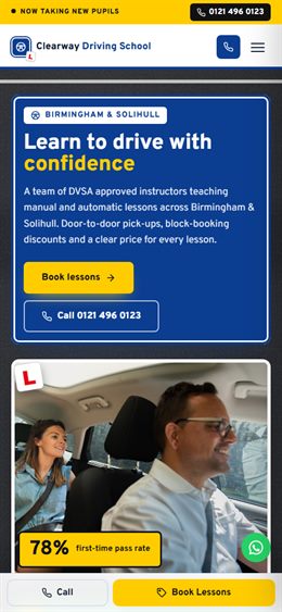
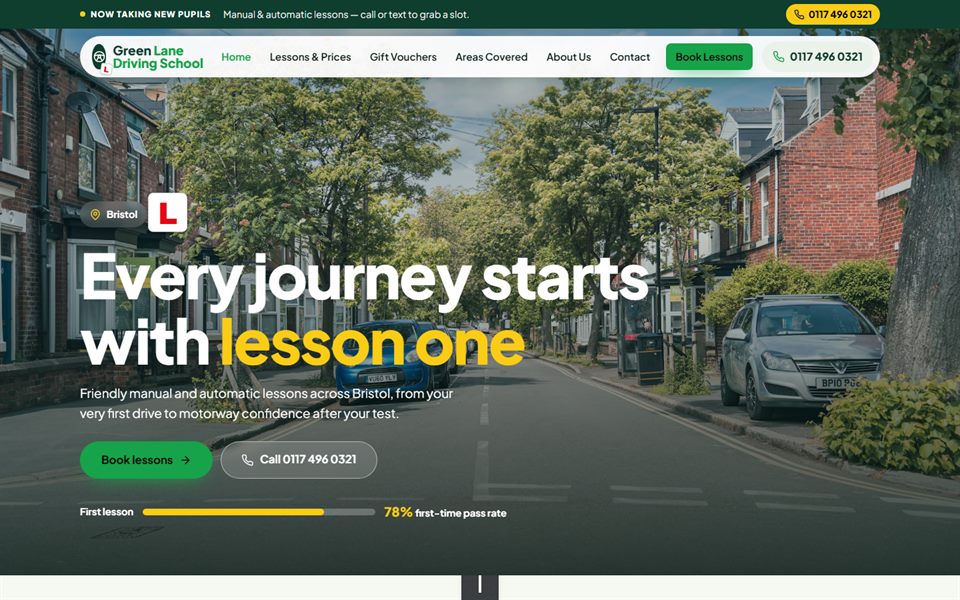
UK road-sign style: motorway blue, white and sign yellow, moving lane markings in the hero and a price guide laid out like a motorway sign.
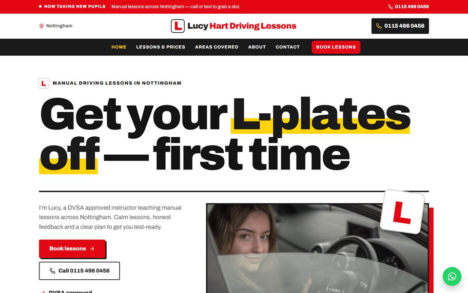
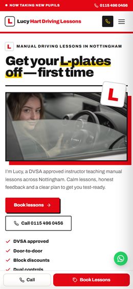
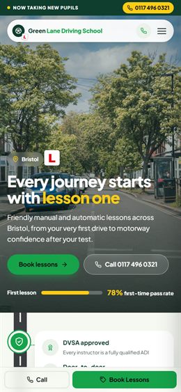
Bright and celebratory: a giant L-plate, a big first-time pass-rate counter, a “recent passes” board and bold red and white.
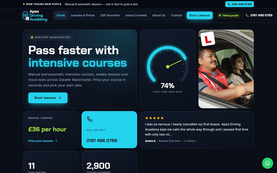
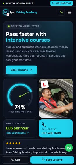
Night-drive instrument panel: a speedometer showing the pass rate, glowing dials and a price guide that works like a trip computer.
Your journey to a full licence drawn as a road map — first lesson, mock test, test day — with test centres as map pins.
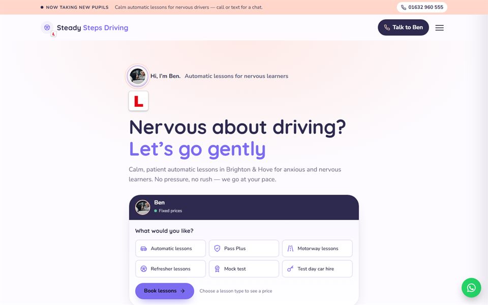
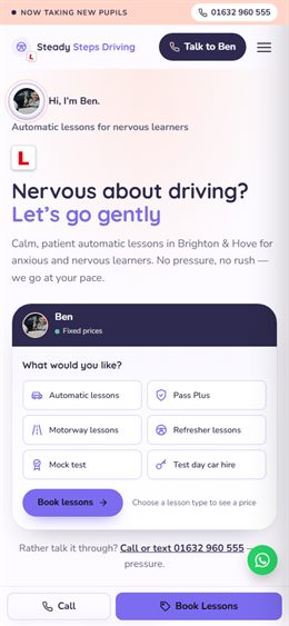
Calm and reassuring for nervous learners: soft lilac and peach, rounded shapes, gentle words and a chat-style price guide.
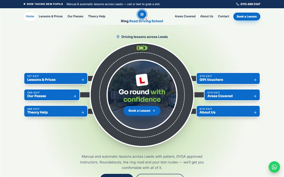
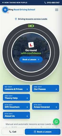
Everything turns around one big roundabout: the hero is a hub with an exit for each part of the site, round photo cards and a turn-the-dial price guide. Sign blue and island green.
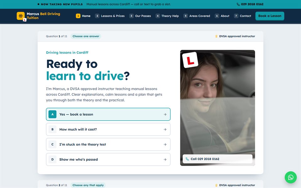
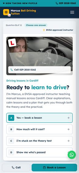
Laid out like a theory-test screen: every section is a question with answers to tap, a progress bar across the top and a pick-one-answer price guide. Navy, teal and amber.
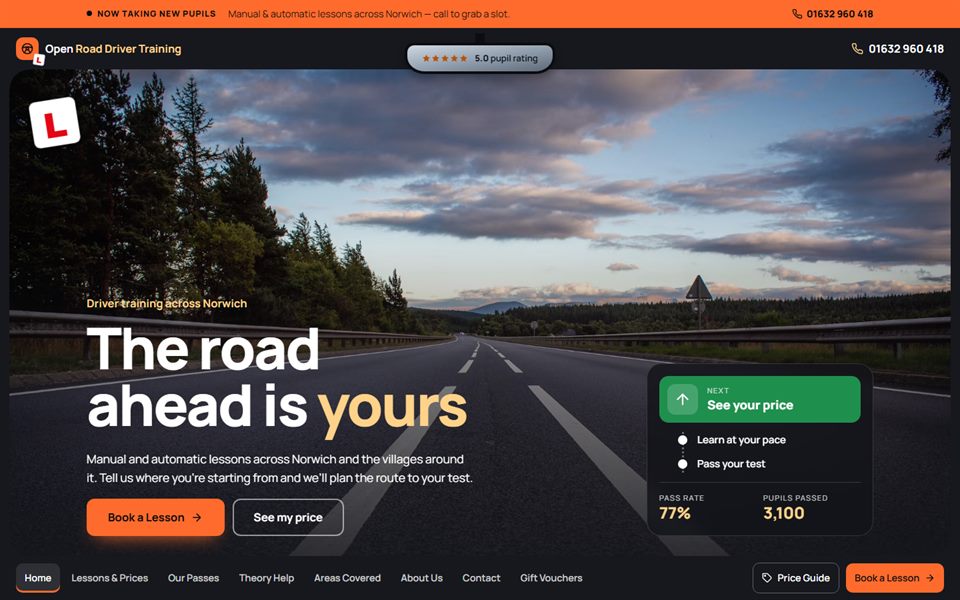
The whole site is seen through the windscreen: a frame stays around the screen with a rear-view mirror up top, big road photography and a sat-nav style planner that works out when you’ll be test-ready.
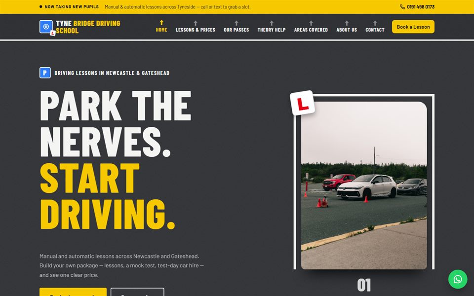
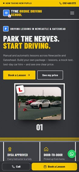
Painted on tarmac: tall road-paint lettering, lessons parked in angled bays, a yellow box junction footer and a build-your-own package price guide.
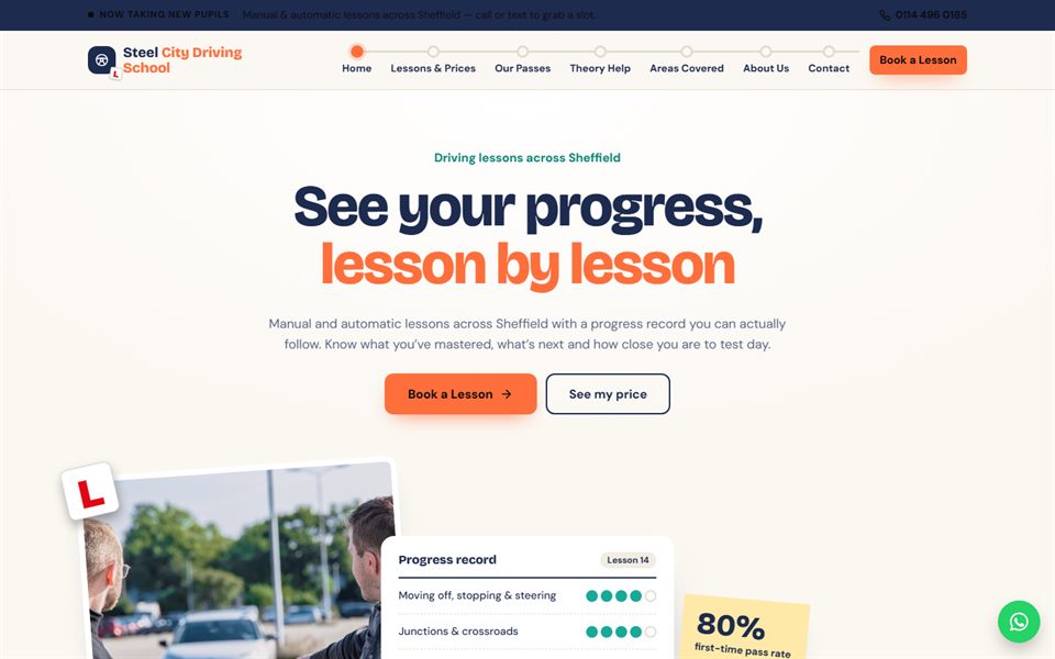
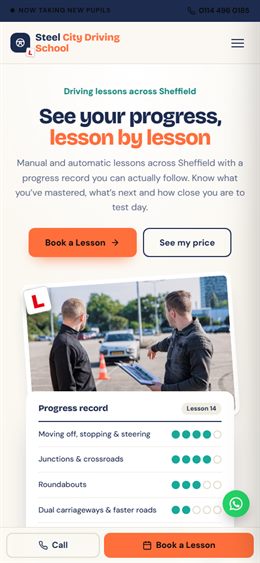
A learner’s progress record: skill meters that fill as you scroll, a journey bar from first lesson to pass, and a “how many lessons will I need?” estimator. Navy ink, coral and teal on paper white.
Tell us your own idea and we’ll send you a price to design and build it for you.